Custom block
Read the full guide to learn everything about the Custom block or go directly to the section you’re interested in:
— Tips.
The Custom block is a built-in professional editor in Taplink that lets you create unique blocks with your own design. It’s like popular graphic editors, but simpler, more convenient, and right inside Taplink.
The Custom block allows implementing ideas of any complexity, including creating a page header, a banner, a gallery, product cards, and more:
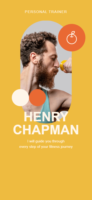
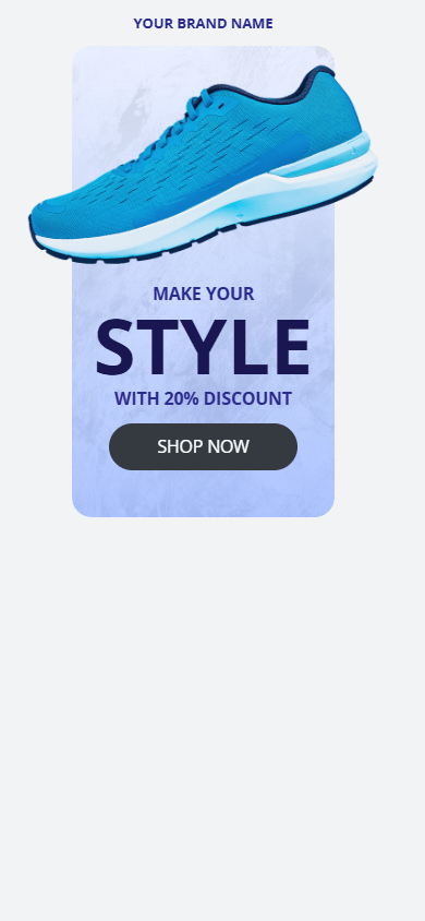
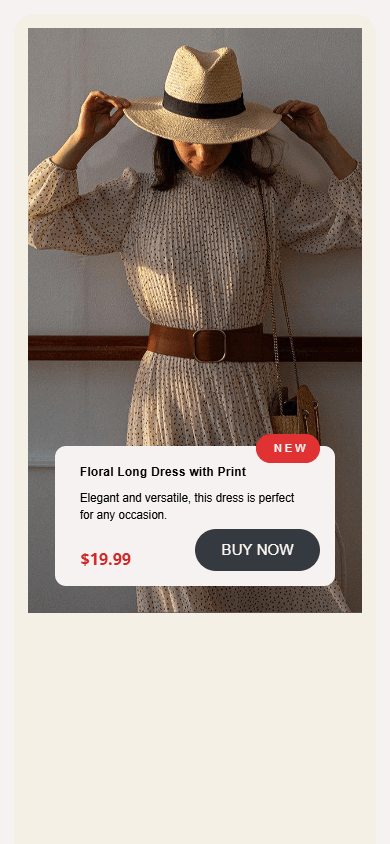
The block uses a modular grid; it automatically adjusts to different screens and devices.
Creating and editing the Custom block is easy on both a computer and a phone.
The basic features of the block are available with the BASIC plan. All features are available with the PRO and BUSINESS plans.
There are two ways to add the Custom block:
- Select a ready-made template from the library and customize it.
- Create it from scratch.
The template library offers the following categories:
- About me.
- Promo banners.
- Navigation.
- Galleries.
- Features.
- Products.
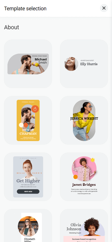
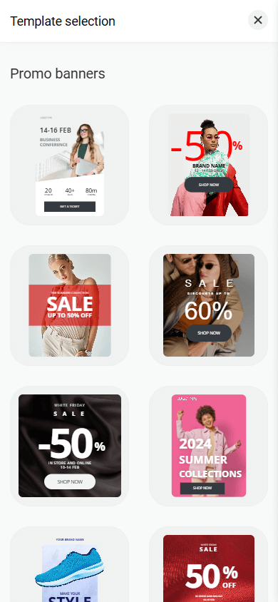
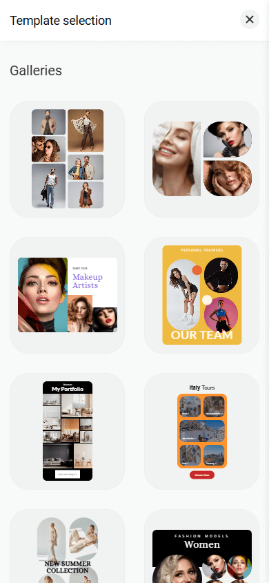
You can customize each template to fit your needs: edit text, upload your own images, change colors, add or remove elements, rearrange elements, adjust spacing, and more.
To use a ready-made template:
- In the editor mode, tap Add block.
- Select the Custom block.
- Tap the template you like.

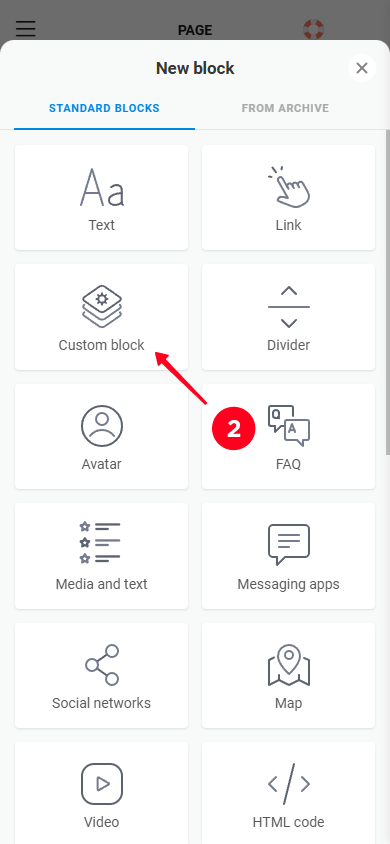
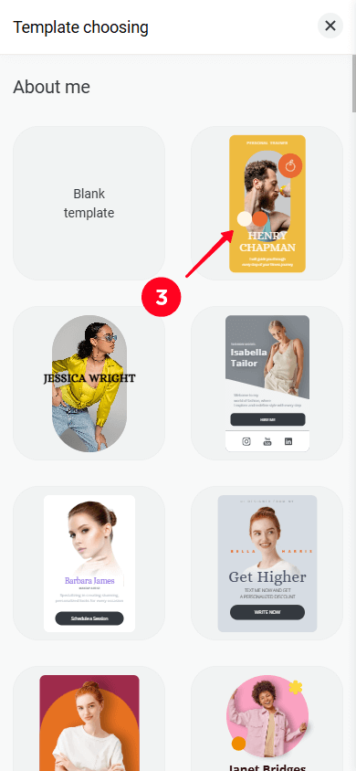
This will open the block editor, where you can make any changes you want.
To create the Custom block from scratch:
- In the editor mode, tap Add block.
- Select the Custom block.
- Tap Blank template.
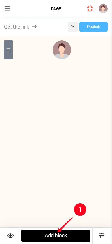

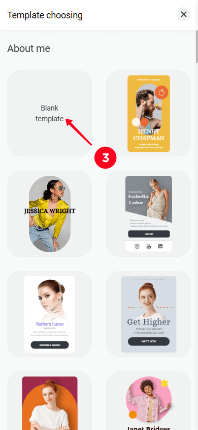
This will open the block editor. Let’s take a closer look at its interface.
The editor interface consists of three main parts:
- Layers.
- Layout.
- Layout settings.
The interface may look slightly different depending on the device you’re using. Here’s what it looks like on a computer:
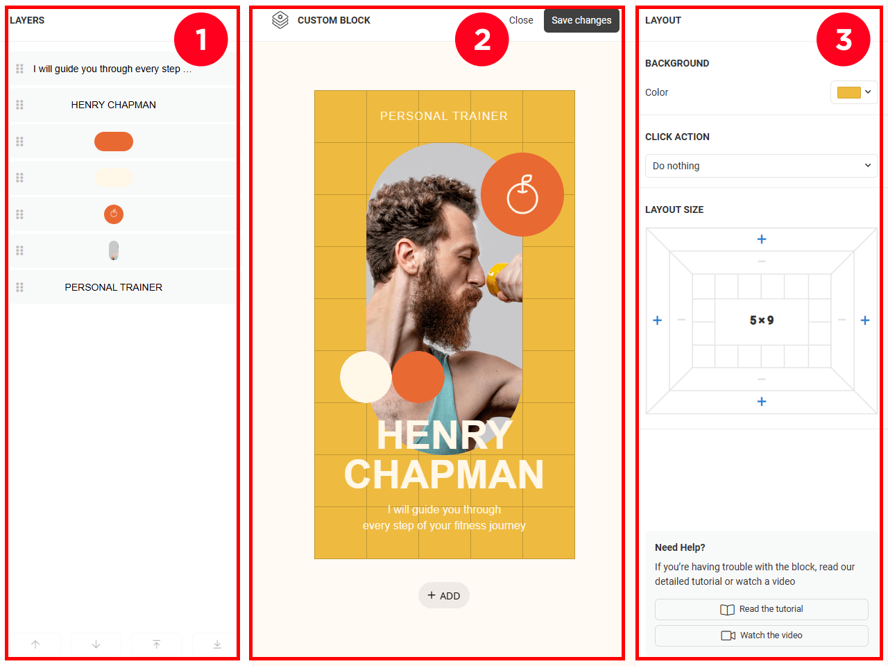
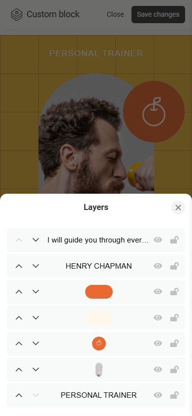
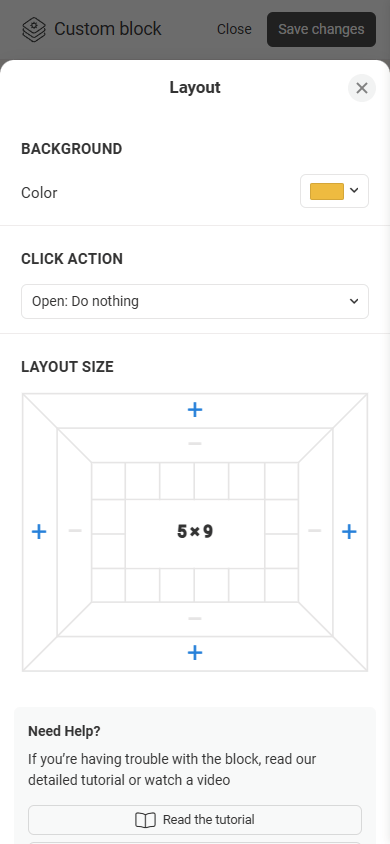
If you use a phone, you’ll see the layout by default. To access the Layers panel or the layout settings, tap the corresponding icons (1 and 2).
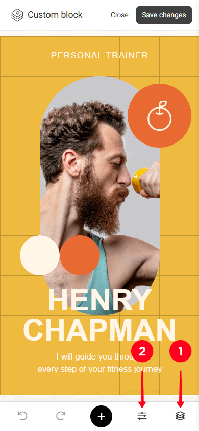
If you use a phone, you’ll also see two extra buttons:
- Undo.
- Redo.
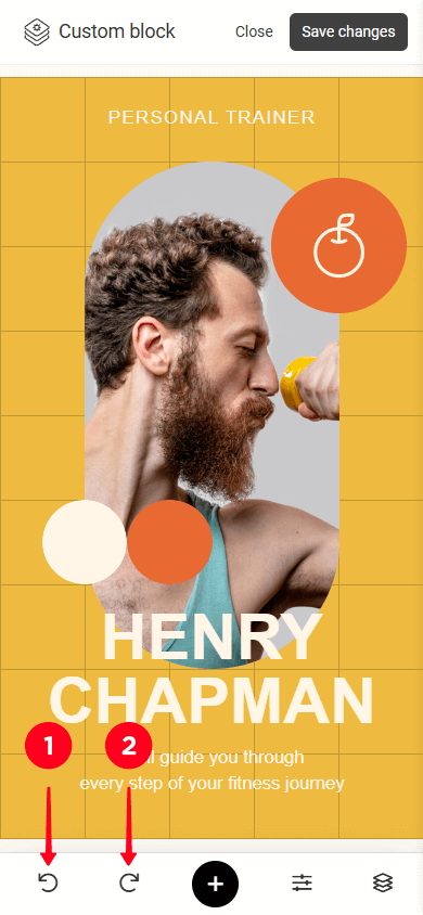
When editing on a computer, use the keyboard shortcuts: Ctrl + Z to undo and Ctrl + Shift + Z to redo.
Next, let’s take a closer look at the main parts of the interface.
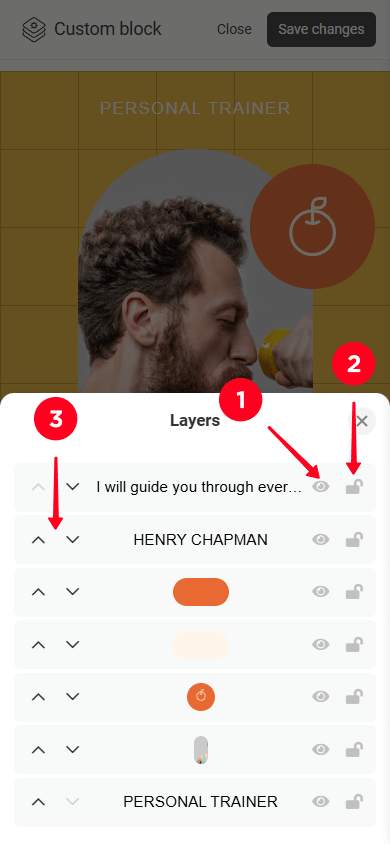
The Layers panel displays a list of all the elements added. Here’s what you can do with each layer:
- Hide / show.
- Lock / unlock.
- Move a layer up (to the front) / down (to the back).
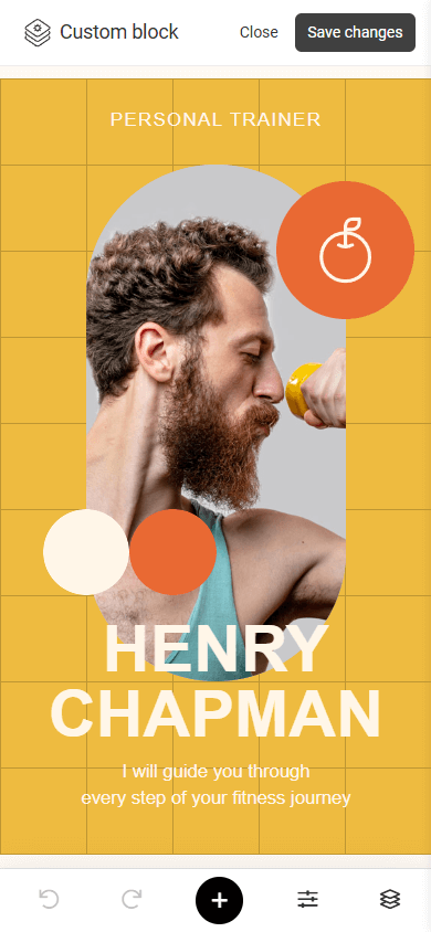
The layout is the area where you can add elements and create a design. The area uses a modular grid that elements snap to.
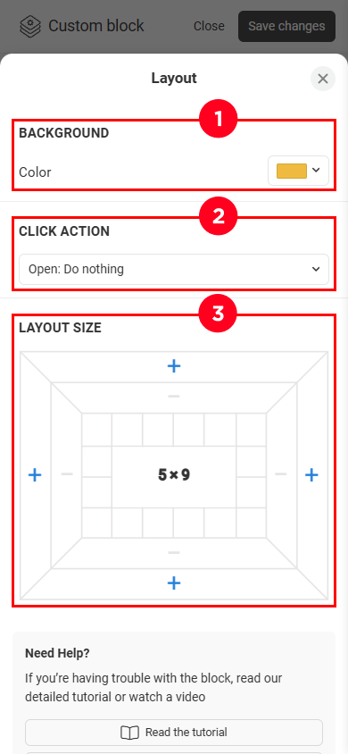
This is where you can find the layout settings, such as:
- Background.
- Click action.
- Layout size.
Let’s go over each setting in more detail.
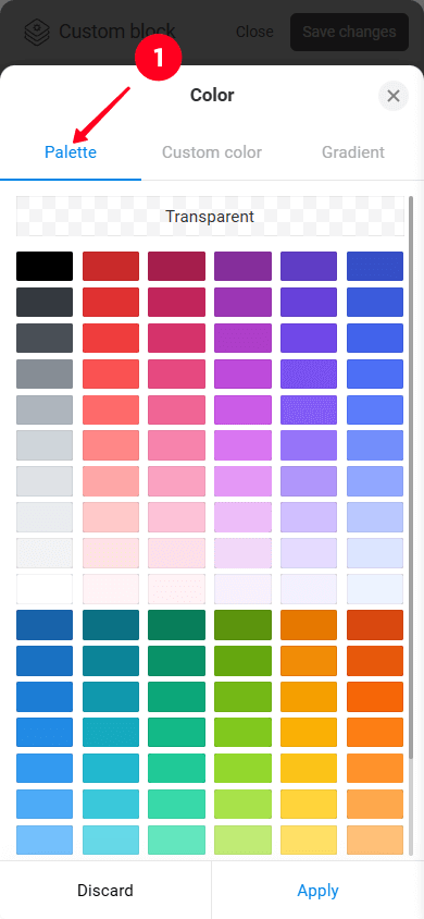
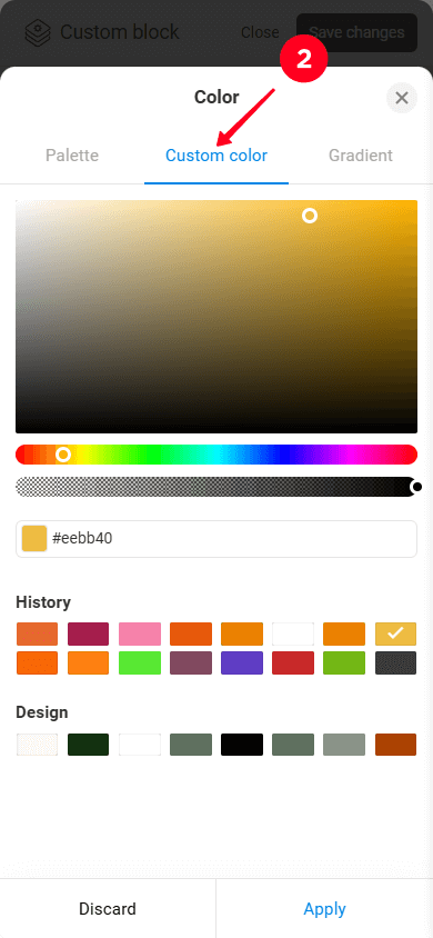
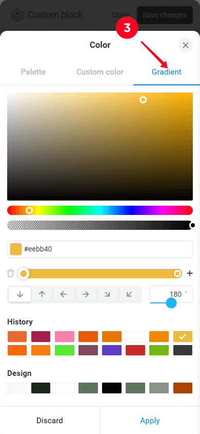
For the layout background, you can:
- Select a color from the palette.
- Set a custom color.
- Create a gradient.
Click action is a setting that makes the entire block clickable. When clicked, a specific action such as making a call, opening a digital product, redirecting to an external website is performed.
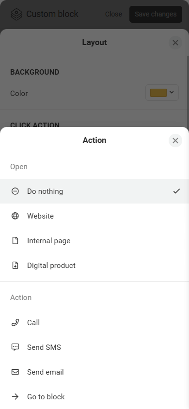
Please note that if Click action is enabled for the entire block, this setting is no longer available for individual elements within the block.
The default layout size is 8×6 (8 columns and 6 rows). To change the size, tap “+” or “–” on the side you want to expand or shrink (top, bottom, right, or left).
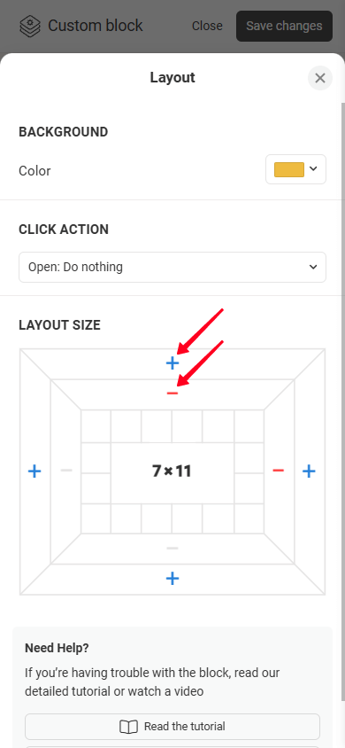
The minimum layout size is 1×1. The maximum size is 12 columns wide and 36 rows tall.
The Custom block supports the following elements:
- Text.
- Button.
- Rectangle.
- Icon.
- Shape.
- Image.
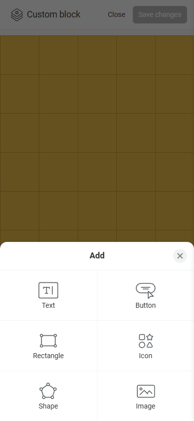
You can add elements to the layout in several ways:
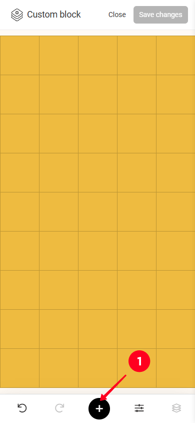
- Tap “+” (or “+ ADD” on a computer) and select the element you need. This will add a 2×2 element to the center of the layout.
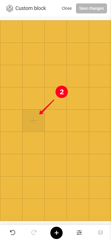
- Double-tap any cell in the grid and select the element you need. This will add a 1×1 element in the exact cell you tapped.
- Select multiple cells and choose the element you need. This will add the element inside the selected cells.
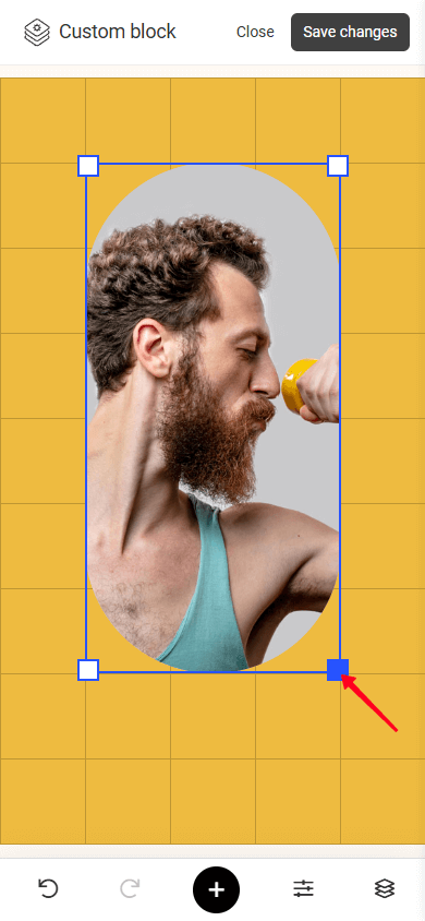
To resize an element, drag one of the square handles at the element’s corners.
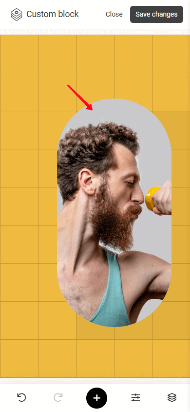
To move an element, select it, hold and drag it to the position you need.
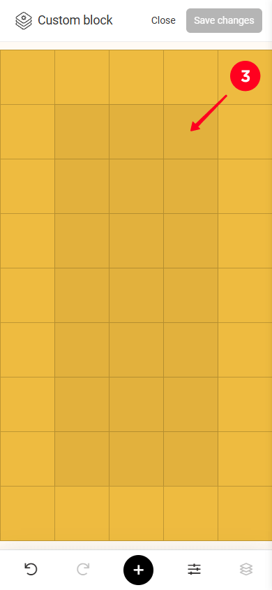
If you work on a computer, you can also use the arrow keys to move the element.
All elements in the Custom block can be customized. To access the settings for an element, tap on it.
Some settings are common for multiple elements (let’s call these “Repeating” settings), while others are unique and available for specific elements. We’ll start with the repeating settings, then we’ll move on to unique settings for each element.
Let’s take a look at the settings that are common to multiple elements.
With each element, you can do the following:
- Delete: Delete the element from the layout.
- Duplicate: Create a copy of the element that will be placed one layer above the original element.
- Lock/unlock: Lock the element on the layout so it can’t be accidentally moved or resized. Unlocking the element makes it editable again.
- Hide/show: Make the element invisible on the layout or display it again.
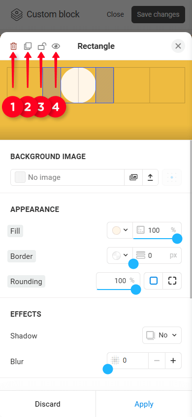
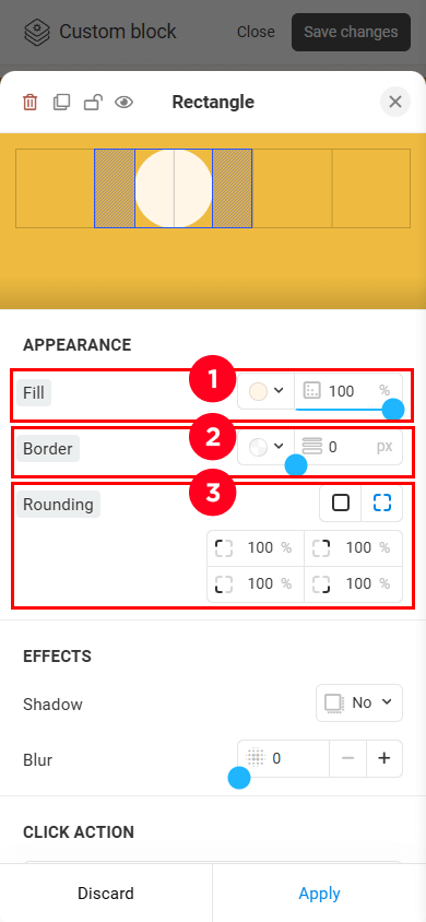
Here, you can adjust:
- Fill: You can set a color (select from the palette, use a custom color, or create a gradient) and transparency.
- Border: You can adjust the color and weight of the element border.
- Rounding: You can apply the same rounding to all corners of the element or set individual rounding values for each corner.
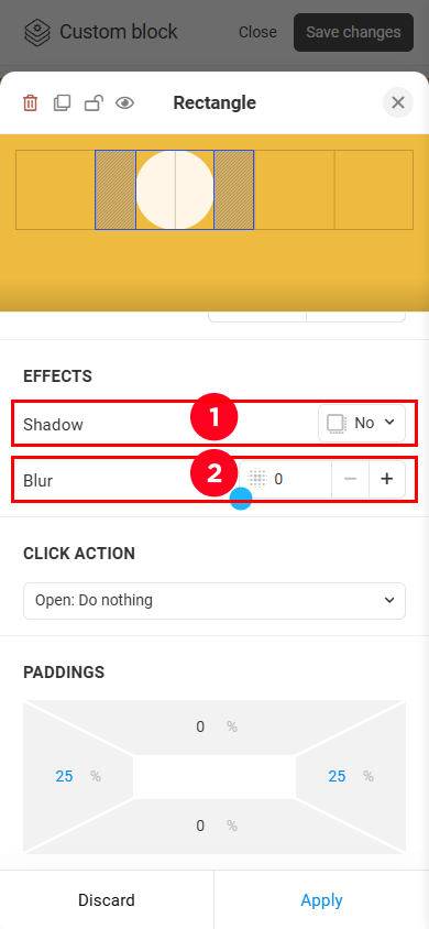
Here, you can adjust:
- Shadow.
- Blur.
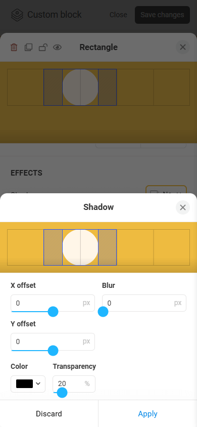
You can set the shadow’s color, adjust its transparency, X and Y offsets, and a blur effect.
This setting (see screenshot #1) makes an element clickable and allows you to assign any available action (see screenshot #2).
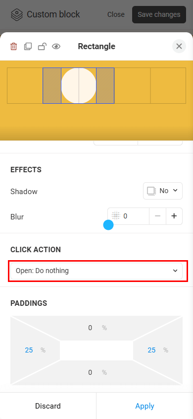
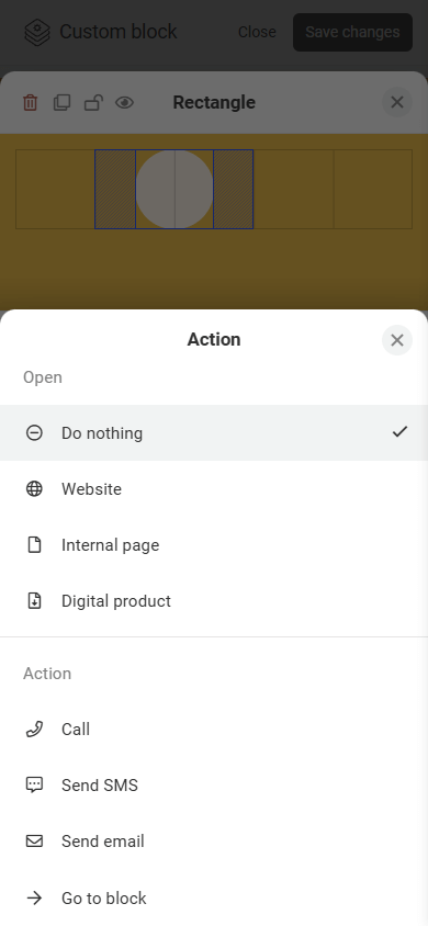
Please note that if a Click action is set for the entire block, this setting won’t be available for individual elements.
For each element (except Shape), you can set internal paddings, including top, bottom, left, and right. Paddings let you fine-tune an element’s position relative to the grid. Padding values are measured as a percentage of the element’s current size. The maximum padding value is 40%.
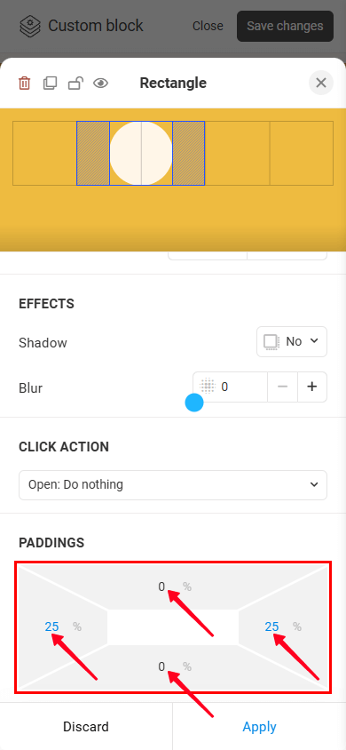
When using a computer, you can adjust paddings without opening the settings. To do so, select the element on the layout, hold and drag the handle located in the middle of the edge you want to adjust.
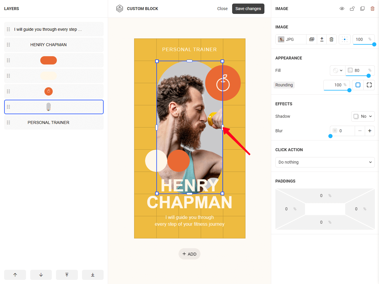
Let’s go through each element and go into more detail about the settings that are specific to them.
This element is used to add any type of text, such as headings, descriptions, lists, and more.
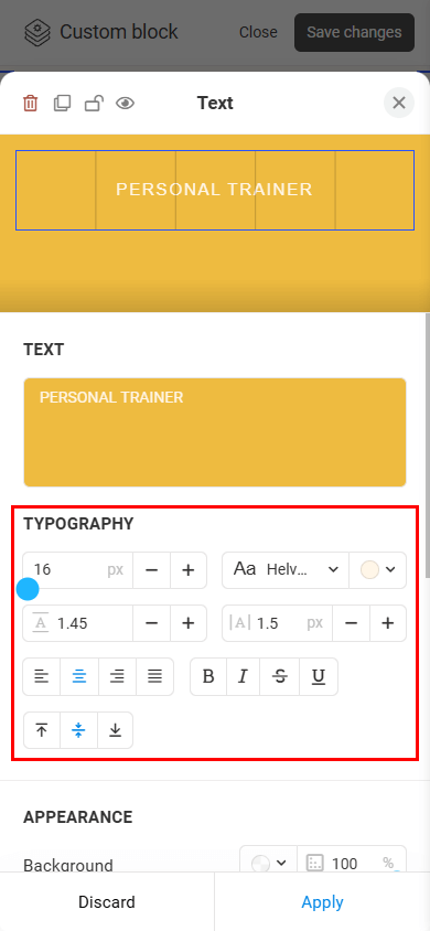
Let’s take a closer look at Typography settings. The Appearance, Effects, Click action, and Paddings settings are adjusted the same way as for other elements.
Typography. The typography settings let you change the following:
- Size.
- Font. In addition to built-in fonts, you can use any font from the Google Fonts library. To do this, type the font’s name in the search bar and select the font you need.
- Color.
- Line spacing.
- Letter spacing.
- Horizontal alignment (left, center, right, or justify).
- Vertical alignment (top, middle, or bottom).
The Button element is used to create interactive elements that guide visitors to take specific actions, such as navigate to another block, another page, or an external website, open a digital product, send an email, and more.
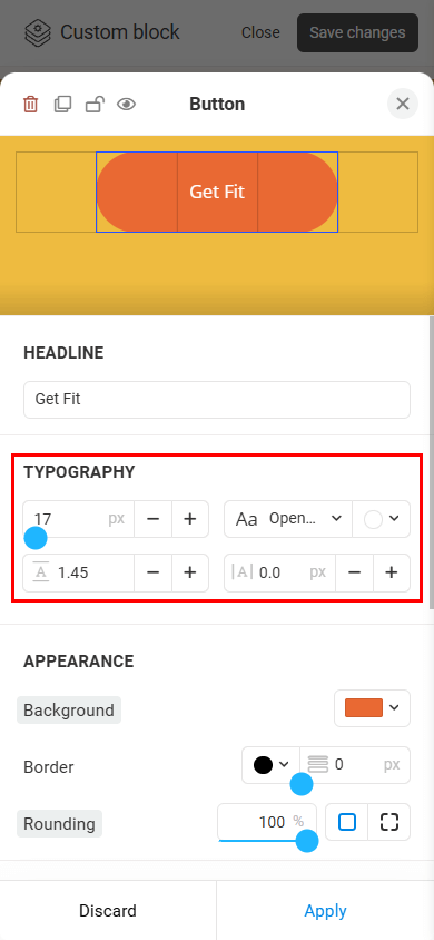
Let’s look at the Typography settings. The Appearance, Effects, Click action, and Paddings settings are adjusted the same way as for other elements.
Typography. The typography settings let you change the following:
- Size.
- Font. In addition to built-in fonts, you can use any font from the Google Fonts library. To do this, type the font’s name in the search bar and select the font you need.
- Color.
- Line spacing.
- Letter spacing.
You can use the Rectangle element to add individual geometric shapes (a square, rectangle, circle) to the layout, create containers, as well as create complex multi-layer designs.
Let’s look at the Background settings. The Appearance, Effects, Click action, and Paddings settings are adjusted the same way as for other elements.
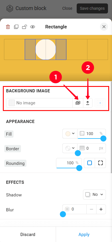
Background. In addition to solid color fills you can set an image as the background. Let’s consider the background image settings in more detail:
— Image source. You can:
- Choose an image from the gallery.
- Upload your own image.
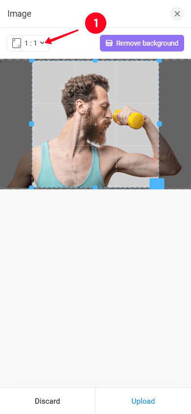
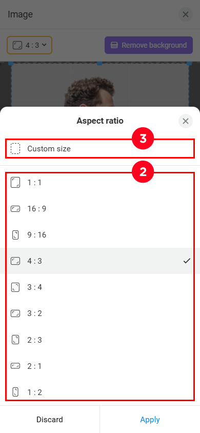
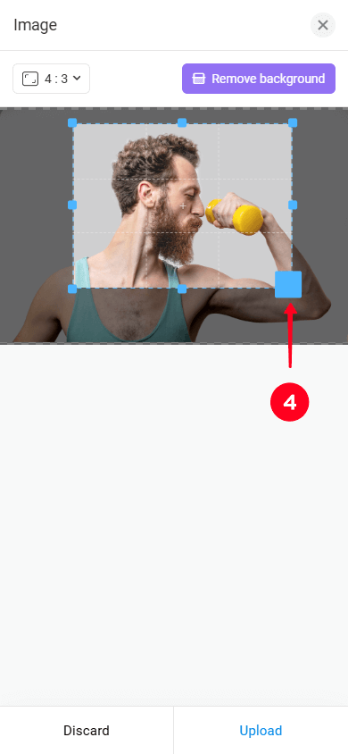
— Cropping. When loading an image, you can crop it. By default, the crop aspect ratio matches the element’s size, but you can change it if needed. You can either select one of the preset aspect ratios (2) or set a custom one (3). After choosing the desired aspect ratio, drag one of the square handles (4) to crop the image.
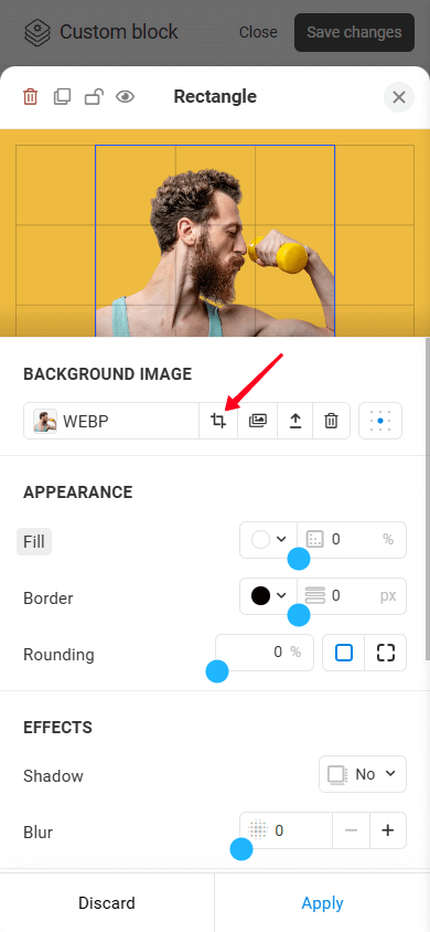
If you need to change the element proportions in the future, you can crop the image again (provided that the image was initially selected from the gallery):
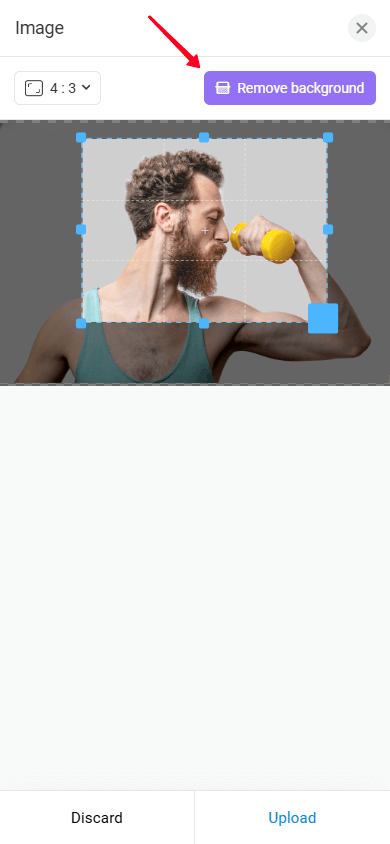
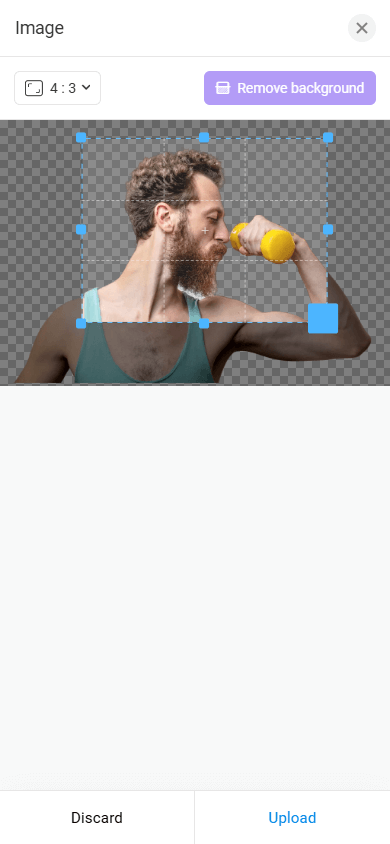
— Background removal. The Remove background feature (see screenshot #1) automatically removes the background from the uploaded image, leaving only the main object (see screenshot #2). This makes it easy to integrate the image into your layout, ensuring a clean and professional look while simplifying object placement on any background.
— Alignment. You can change the alignment of the background image within the element using the corresponding setting:
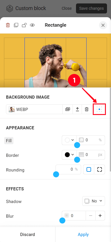
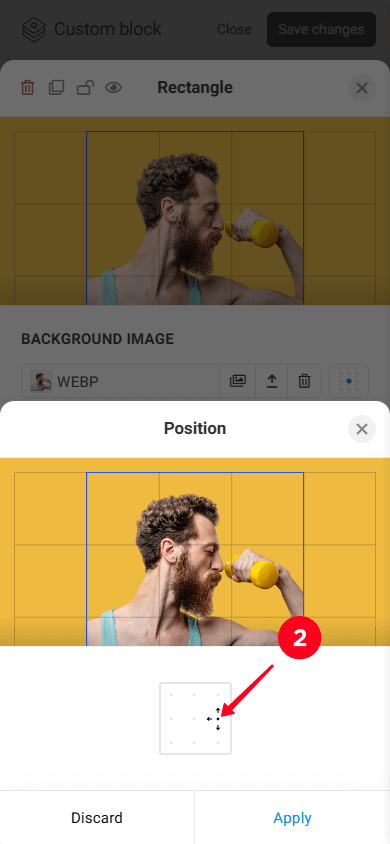
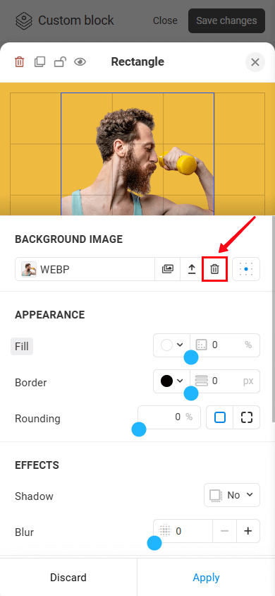
— Deleting an image. If you need, you can delete the image:
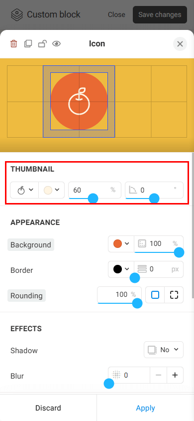
The Icon element allows you to add pre-made icons to your designs. These icons help users navigate the page and quickly understand the purpose of buttons and text.
Let’s take a closer look at Thumbnail settings. The Appearance, Effects, Click action, and Paddings settings are adjusted the same way as for other elements.
Thumbnail. It allows you to change:
- Thumbnail.
- Color.
- Size.
- Rotation.
The Shape element allows you to create polygonal shapes with any number of sides: from triangles to more complex shapes. They can be used as background, decorative, or other graphic design elements.
The background image settings are the same as for the Rectangle element. The Appearance, Effects, Click action, and Paddings settings are adjusted the same way as for other elements.
Let’s focus on how to create a custom shape.
- To adjust an angle and side dimensions, simply drag one of the square handles at the corners of the element.
- To add another corner, tap the circular handle with the “+” sign.
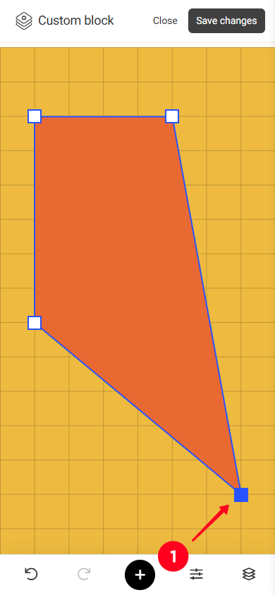
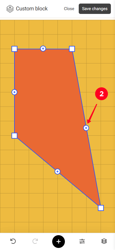
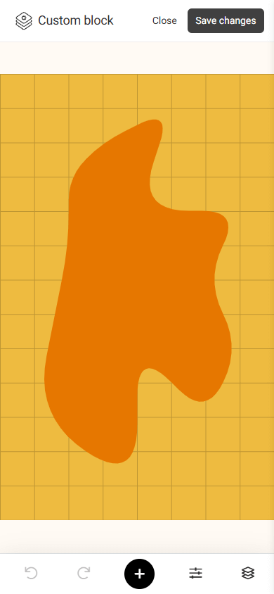
Thus, by adding more sides and using the rounding option in the Appearance settings, you can create the following shape:
You can use the Image element to add visual content, create backgrounds, showcase products, demonstrate services, or design a page to make it more attractive and informative for visitors.
Uploading and adjusting an image works the same way as with the Rectangle element, except that you can also adjust transparency in the Image settings:
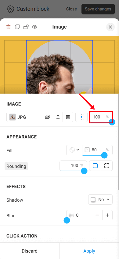
The Appearance, Effects, Click action, and Paddings settings are adjusted the same way as for other elements.
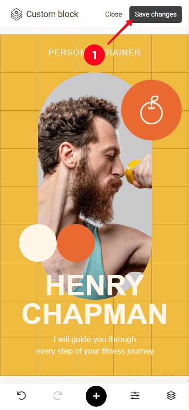
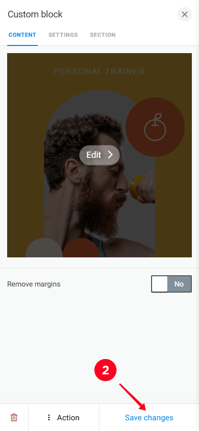
Once you’ve added and customized the elements, you need to save the block. Here’s how:
- Save the layout by tapping the Save button.
- Save the block itself by tapping the Save button again.
These tips will help you work faster and more effectively with the editor settings.
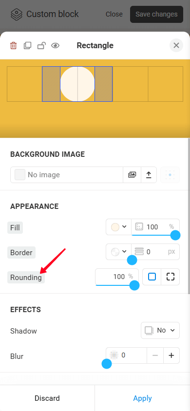
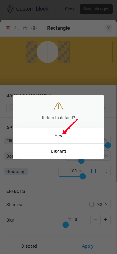
You can reset any setting to its default value. To do this, tap the setting title, which is highlighted in gray. This will open a Return to default? pop-up window. If you tap Yes, the setting will be reset to its default value.
