Navigation menu
This guide describes how to add and customize a navigation menu on a Taplink. Follow 3 simple steps to get one on your Taplink. Or you can get to a particular section if you have a particular question:
A menu allows users to quickly find the information they need. Here is an example of how a menu can look on a Taplink:
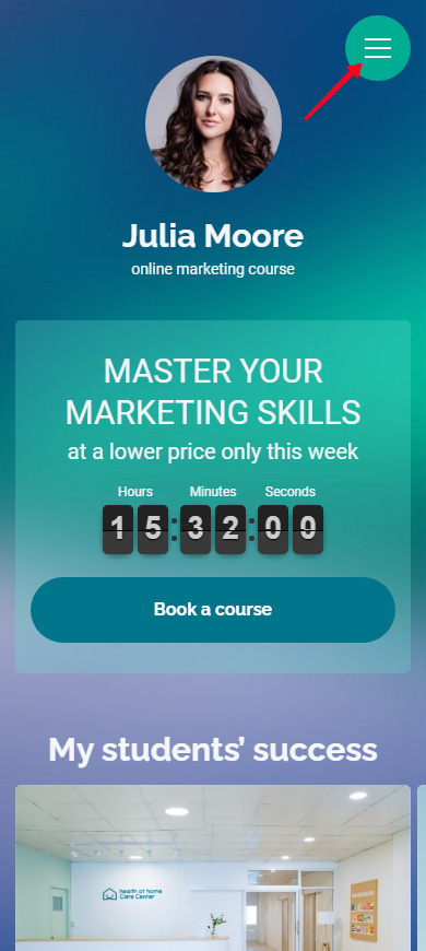
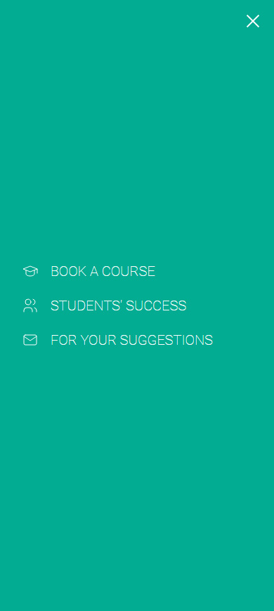
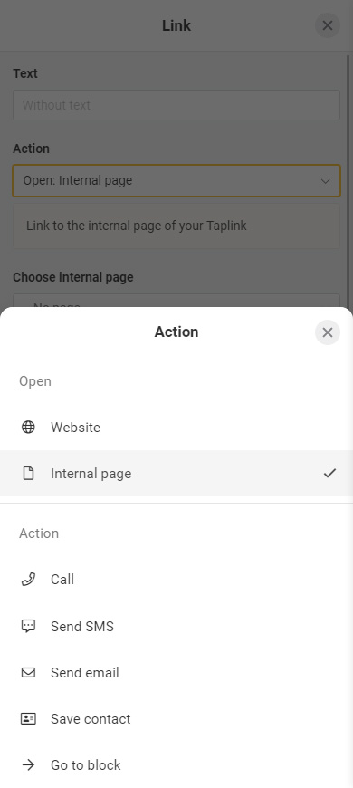
Menu items can direct users to:
- Internal pages of your Taplink.
- Particular blocks on your Taplink pages.
- Any external web pages.
- Phone apps for calls, SMS, emails, and saving a contact.
A menu is available on Pro and Business plans.
Note! If you use a ready-made template, then you first need to publish the page to be able to add a menu. If you use the Empty template, then you can add a menu at any time.
Menu settings are on your Taplink editing page:
- Go to page management.
- Select the Navigation menu tab.

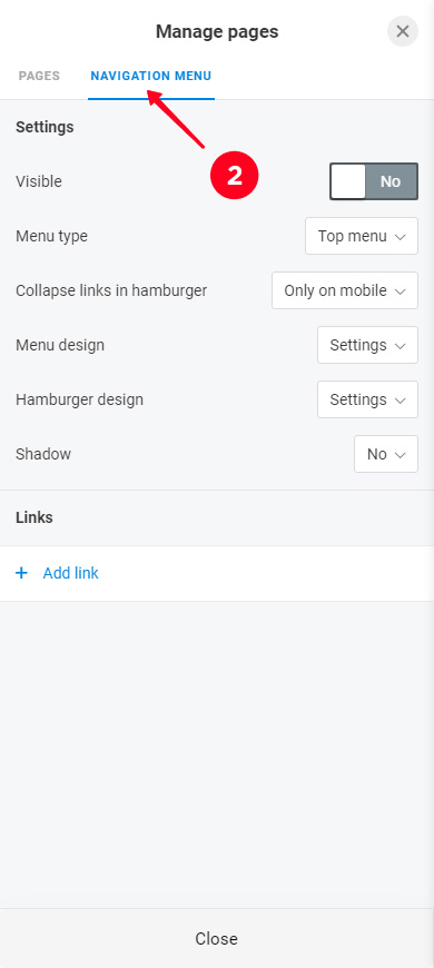
You will see the menu items and design settings. First, let's add menu items, and then tackle the design.
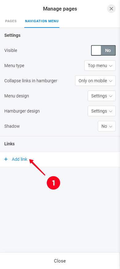
Once you’ve got to the Navigation menu tab, you can add menu items:
- Select Add link.
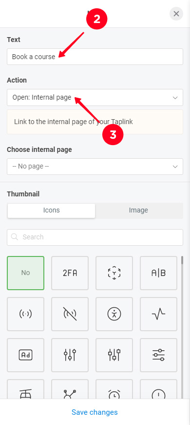
- Enter the text to be displayed.
- Select the item action.
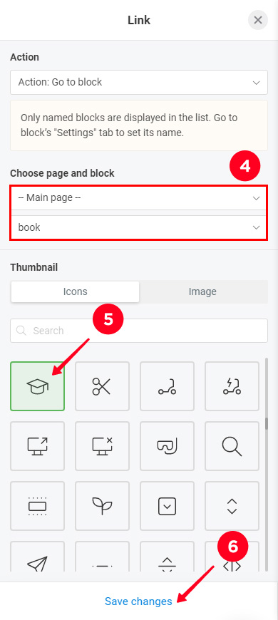
- Choose a page name, and a block name if you want to link to a block.
- Optionally, you can select a thumbnail for the menu item you are adding. The thumbnail can be an icon or a custom image.
- Tap Save changes.
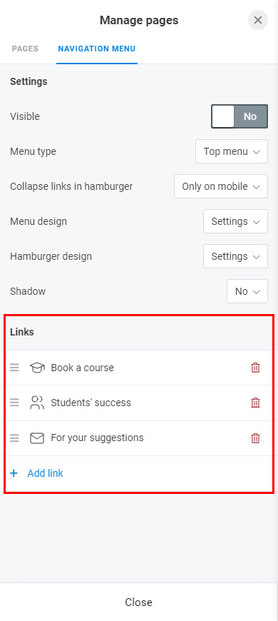
Add another menu item if you want, follow steps 1–5 above for this. We added 2 more items as an example. One of them leads to another block on the same page, and the second one directs users to the email app. This is what it looks like in the settings:
Now that the menu has all the necessary items, let's move on to its appearance. Taplink has various settings for the appearance, below we describe each of them.
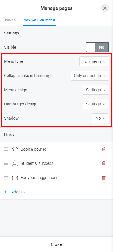
First, let's choose the form and place. A menu can be a:
- panel at the top.
- widget in the top right corner.
- panel at the bottom.
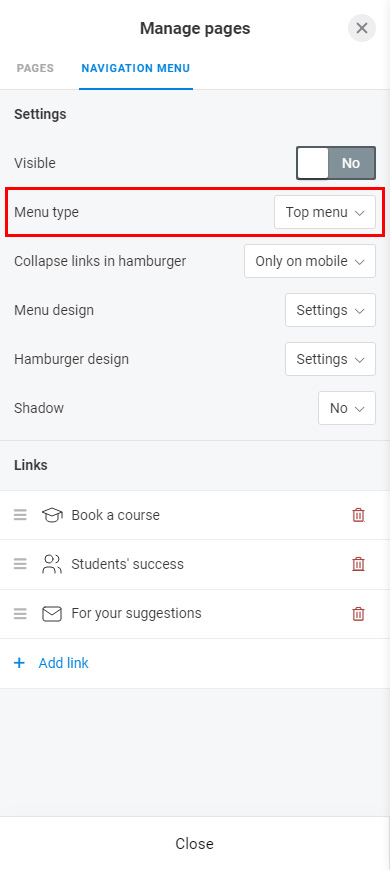
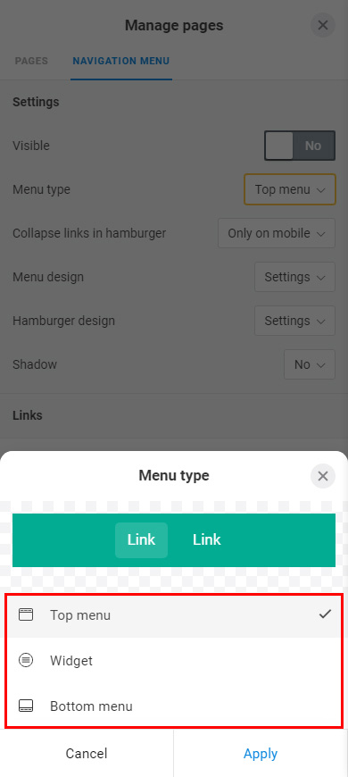
In the screenshots below, you can see how each menu type looks on a Taplink. The first one is the panel at the top, the second is the widget, and the third is the panel at the bottom.
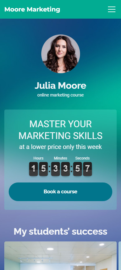
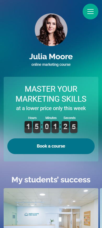

Note that available further settings depend on the type of menu you choose.
Menu items can be displayed or collapsed depending on the device. Choose one of the options:
- Never. Item names are fully displayed on phones and computers.
- Only on mobile. Item names are fully displayed only on computers. On phones, menu items are collapsed behind a hamburger button.
- Always. On both phones and computers, menu items are collapsed behind a hamburger button.
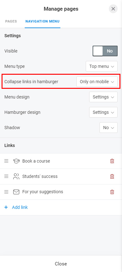
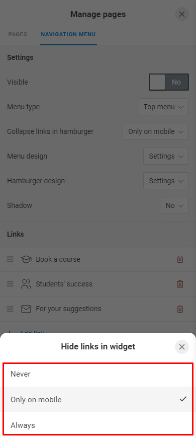
Look at the examples. In the first case, the Never option is selected, so the menu items are displayed. In the second case, the Only on phones option is selected, so the items are collapsed behind a hamburger button.


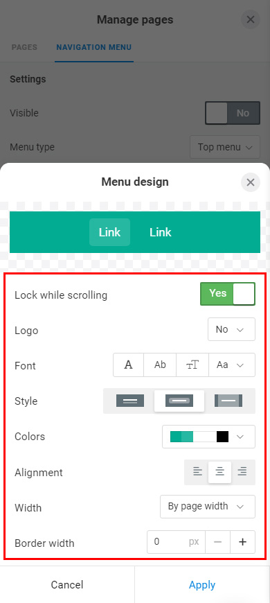
Let's get to the theme settings. Here you can adjust:
- Lock while scrolling. When the button is active, a user sees the menu while scrolling through the page.
- Logo. You can add a logo to the menu. It can be a text or an image.
- Font. Font weight, Letter case, Letter size and spacing, Font.
- Style. Style of the active menu item.
- Colors. Colors menu elements.
- Alignment. Alignment of menu items.
- Width. The width that the menu items occupy on the panel.
- Border width. The thickness of the line above or below the menu.
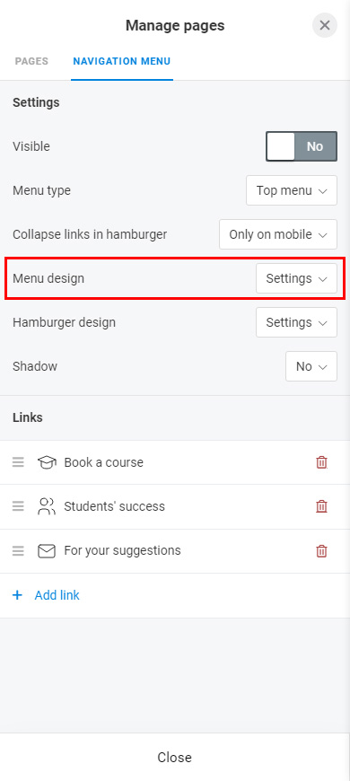
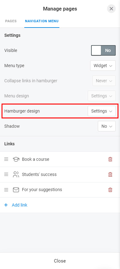
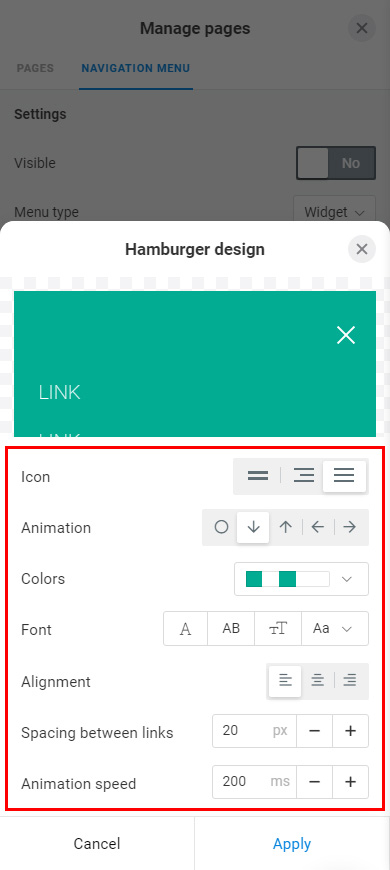
These settings determine the appearance of the menu that opens when a user taps the hamburger button. You can set:
- Icon. The hamburger’s form.
- Animation. Animation when opening and closing the menu.
- Colors. Colors for menu elements.
- Font. Font weight, Letter case, Letter size and spacing, Font.
- Alignment. Menu items alignment.
- Spacing between links. Distance between menu items.
- Animation speed. Animation speed when opening and closing the menu.
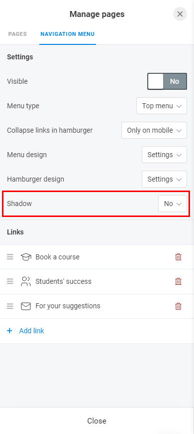
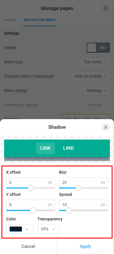
Optionally, you can add a shadow to the menu. The shadow has settings:
- X offset. Move the shadow to the right or left.
- Y offset. Move the shadow up or down.
- Blur. Blur size.
- Spread. Enlarge the shadow proportionally along the X and Y axes.
- Color. Shadow color.
- Transparency. The transparency of the shadow.
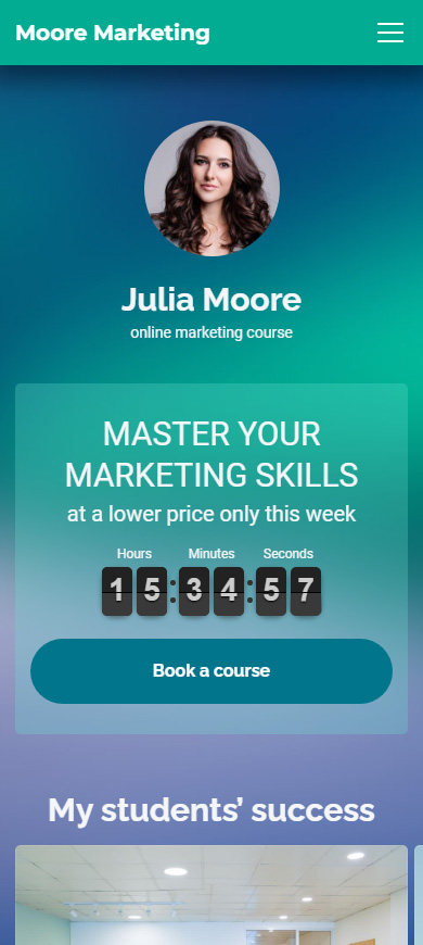
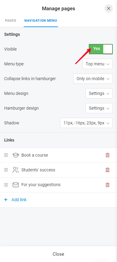
Now that you've set up your menu, it's time to make it appear on your Taplink. Tap the Visible button for this. When the button is active, the menu is displayed on your Taplink.
Now, users won't get lost on your Taplink. Be sure to share your Taplink link in social profiles if you haven't shared it yet.
Here you can find answers to the questions that may arise when you create and use the menu.
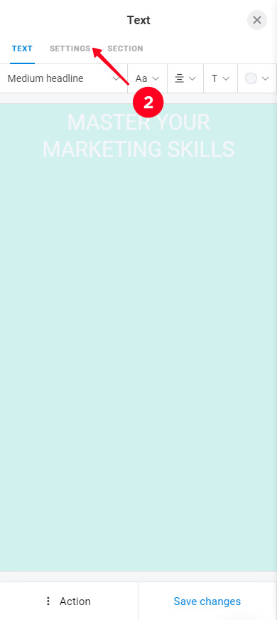
You can direct users to a particular block on your Taplink page. You need to give this block a name first for this. Here's how to give the name:
- Tap the block.
- Select the Settings tab.
- Tap the Set block name button to activate it.
- Specify the name of the block.
- Tap Save changes.
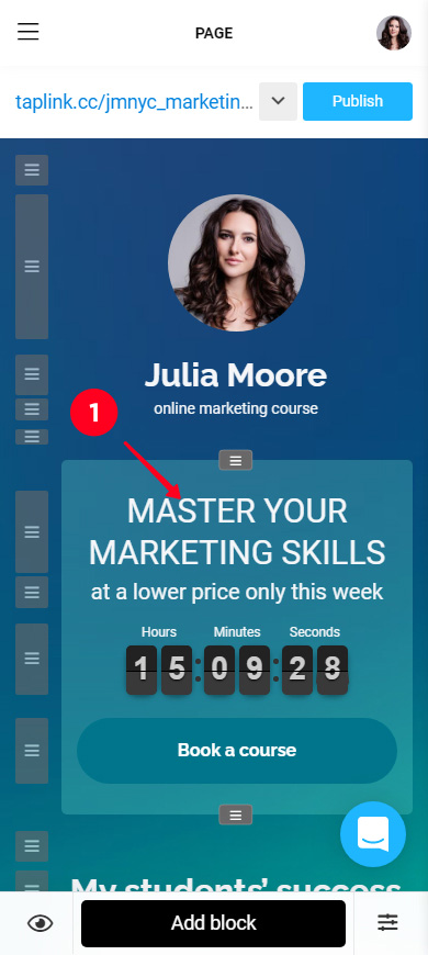
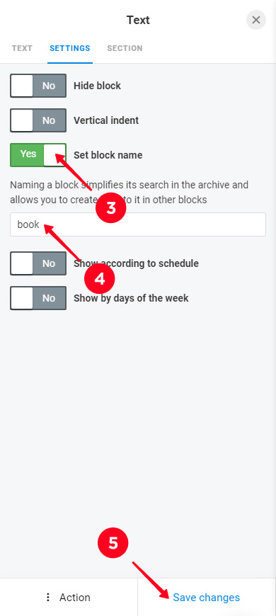
That's it, now you can link to this block. Read how to do this above.
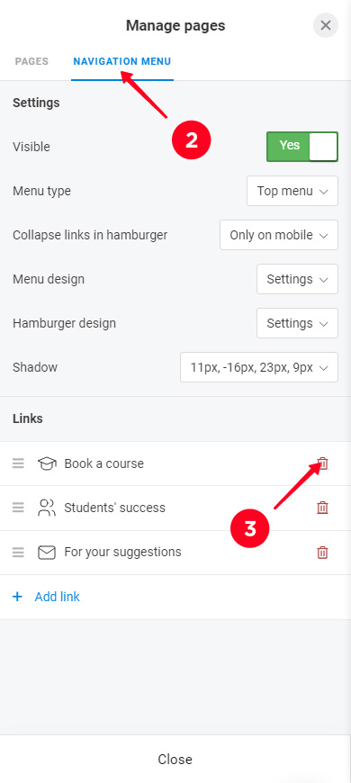
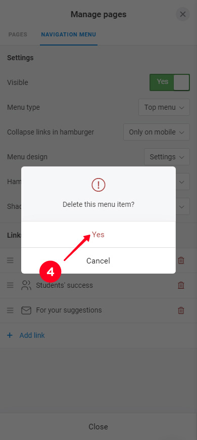
You can remove a menu item at any time:
- Go to page management.
- Select the Navigation menu tab.
- Tap the delete icon next to the item.
- Tap Yes.

If you want to remove the menu from your Taplink, you need to deactivate the Visible button:
- Go to page management.
- Go to the Navigation menu tab.
- Tap the Visible button.
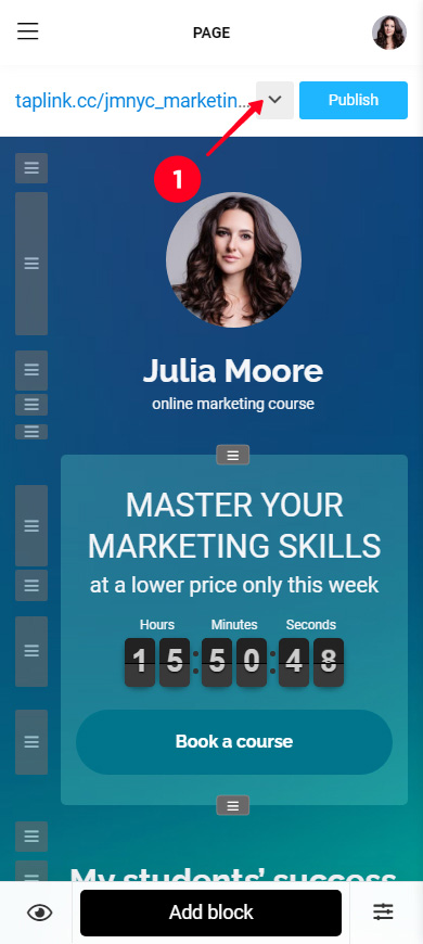
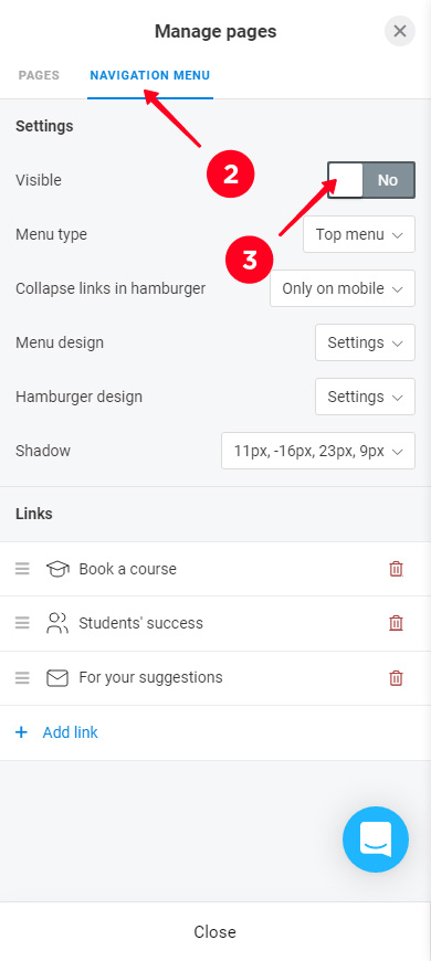
When you need the menu on your Taplink again, all you need to do is activate the Visible button again. All menu settings are saved. The menu will be displayed as you adjusted it earlier.