How to create a landing page for your small business

- Step 1: Define a goal
- Step 2: Understand your audience
- Step 3: Choose the right platform
- Step 4: Select a perfect template
- Step 5: Create content
- Introduce your company
- Present your product/service
- Leverage social proof
- Craft a form
- Include a call to action
- Add imagery
- Apply other essential elements
- Step 6: Infuse your brand identity
- Step 7: Choose a domain name
- Step 8: Test links and buttons
- Step 9: Promote your landing page
- Step 10: Analyze your landing page
- Common pitfalls when creating a landing page for your small business
- Conclusion
Crafting a successful landing page begins with a precise understanding of its goal, whether it’s to boost sales, capture leads, or increase sign-ups. The goal you choose dictates every design element, informs the content you choose, and ultimately determines if visitors become loyal to your product or service.
Example: Take a look at this landing page.
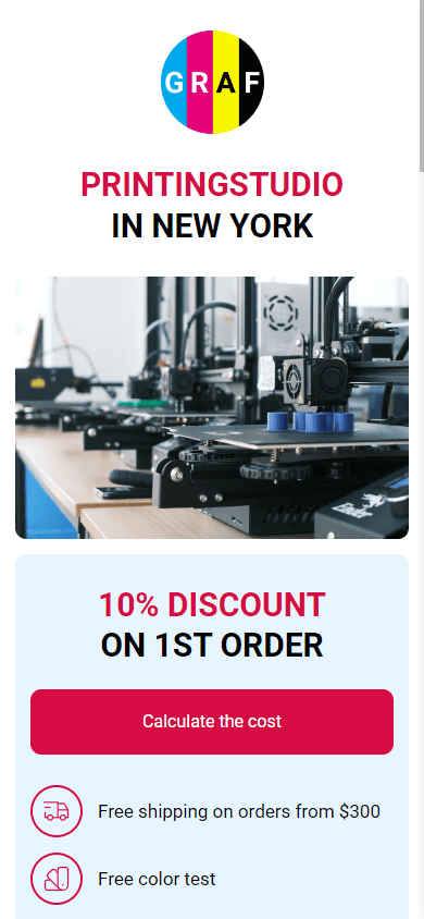
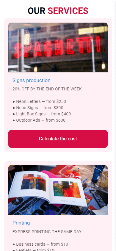
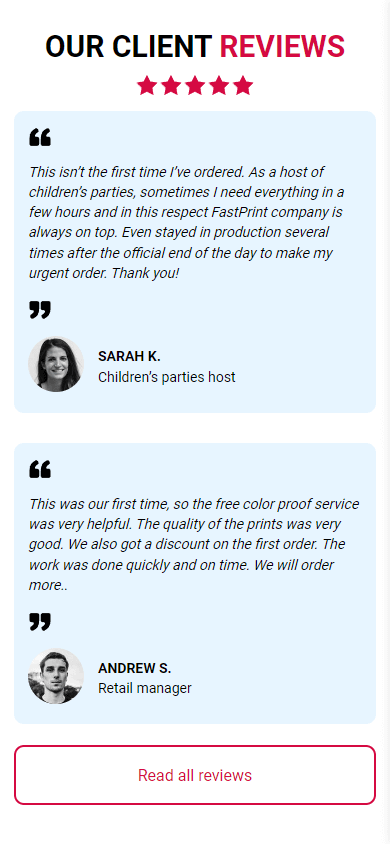
In this example, we see that the goal of the printing studio’s landing page is to sell its services: printing and sign production. Every element on the page is geared towards achieving this goal: bright buttons telling visitors what to do, a discount offer, positive reviews, and a proposal of favorable terms.
If you like this template, you can use it by following the link. To access the template, you need to be signed up for the Taplink website.
Knowing your audience deeply influences your content strategy, design decisions, and messaging to ensure it resonates with your visitors. Begin by researching your audience’s pain points, then showcase how your product or service solves them.
Example: Here’s another good example of identifying pain points and offering solutions.


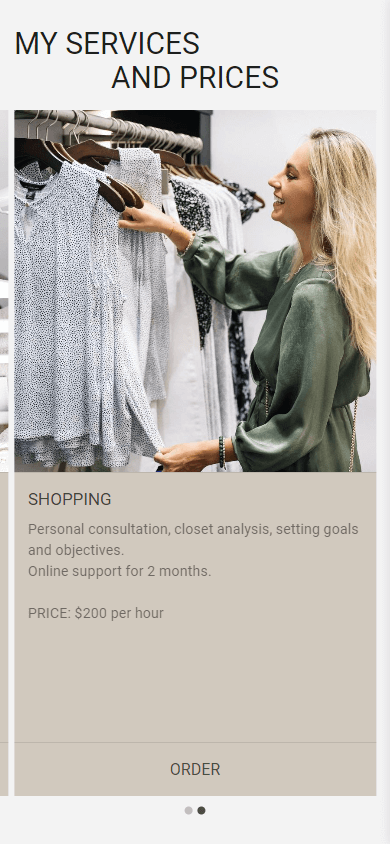
You can use this template by following the link.
Here, the potential client’s pain points include: having nothing to wear, experiencing stress while shopping, disliking their appearance in the mirror, and purchasing unnecessary items. The personal stylist offers to address these problems by analyzing the client’s current wardrobe, providing recommendations and advice, and setting goals for the client.
Once you’ve defined the goal and target audience of your landing page, it’s time to select a platform to build it.
There are numerous website builders available today for creating landing pages such as WordPress, Wix, Unbounce, Taplink. Choosing the right builder depends on your specific needs.
For example, Unbounce and Wix are excellent tools for building landing pages, but their services can be costly for small projects. WordPress, however, is a free platform but requires technical knowledge, especially for configuration and plugin integration.
If you need to create a landing page quickly, without technical skills or unnecessary investments, consider using Taplink. Taplink offers the following features:
- Rapid creation: The average time to create a landing page is 15 to 20 minutes.
- A vast template library: A wide range of pre-designed templates for over 20 different business niches: design, marketing, real estate, education, health, and others.
- Deep customization: Each template is fully customizable, allowing you to modify button and background colors and size, form fields, fonts, layout, and everything on your landing page.
- Free plan: A completely free plan that allows you to use all of Taplink’s basic features to create landing pages.
- No-code creation: You don’t need any technical or programming skills to create a landing page.
- Digital sales: You can sell digital products directly from your landing page, including PDF files, presentation templates, ebooks, and other digital assets. No fees involved.
- Analytics: Taplink provides basic analytics to track the performance of your landing page. You can also connect additional analytics services if you wish.
With Taplink, you can create a unique landing page quickly and easily, even on your mobile phone.
When choosing a template from a website builder, it’s crucial to consider the specific characteristics of your business and target audience. Different industries call for distinct design styles. Here are some examples of various industries and recommendations for landing page design for each:
- Corporate services and B2B: The style should be professional and formal. Opt for templates with minimalist designs, clean lines, and classic fonts.
- Creative professions: There’s room for more creative expression in template selection. Vibrant colors, unconventional fonts, and peculiar layouts can help capture readers’ attention.
- Children’s products and services: Embrace bright and cheerful colors like yellow, green, and blue. Templates should be friendly and fun, featuring large images of children and their products.
- Education: Instill a sense of calm and trustworthiness by utilizing soothing and neutral tones. Prioritize simplicity and accessibility of information to ensure a positive learning experience for visitors.
- Health and sports: Incorporate clean and fresh designs, emphasizing visual content such as photos and videos that showcase your services and the positive outcomes you deliver.
Another important point is that your landing page should be initially designed for mobile phones. According to 2024 studies, almost 60% of users access web pages from their mobile phones. Therefore, optimizing landing pages for mobile devices directly impacts conversion rates.
If you choose Taplink to create your landing page, then there’s a good opportunity to build a page that is inherently designed for mobile devices. This will significantly increase your conversion rates and, as a result, boost your sales.
Taplink also offers templates for over 20 different industries, from veterinary and sports to education and real estate. Below are just a few examples of the ready-made templates that you can customize to fit your business. You are sure to find the one that meets your requirements.


Feel free to explore and utilize Taplink templates.
If you need more information on how to customize a template, you can find detailed guidance on selecting and customization.
The content on your landing page should be clear, informative, and persuasive, ultimately guiding your audience towards taking action. Here’s a guide to crafting compelling sections for your landing page.
Visitors arriving at landing pages from paid social ads are likely in the early stages of their buying journey. They may be aware of a general problem they need to solve but lack knowledge of specific solutions. Therefore, the first thing you need to do is present your company name and explain what it does.
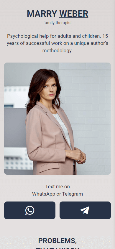
Example: Let’s take a look at how you can introduce your company using the example of how the psychologist introduces herself.
Utilize this template by clicking on the link.
As soon as we open the landing page, we can immediately understand who owns the page, what the owner does, and what sets her apart from the competitors — her unique methodology.
Now tell your audience about your product or service. People care more about how your product/service improves their lives than what it does. Remember what we said about customer pain points. So highlight the key benefits your offering provides and how it solves specific problems of your audience.
Example: Let’s continue analyzing the above landing page example for a psychologist.
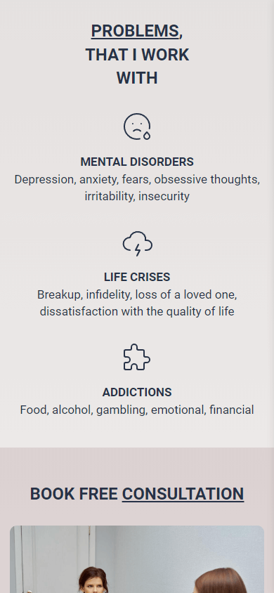
When describing her services, the author lists in detail the difficulties her audience may face: depression, anxiety, fears, breakups, food or alcohol addiction. And if page visitors have any of these problems, they know that the psychologist can help them.
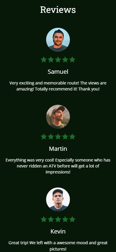
Testimonials, reviews, and customer case studies can significantly boost credibility. Showcase positive feedback to demonstrate the value your product or service delivers to others. You can add photos of your satisfied customers, along with their company names or the star ratings they gave your product/service.
Example: Here is an example of how you can format testimonials on your landing page.
Feel free to adopt this template for your own purposes here.
Your landing page has a singular purpose: convert visitors into leads or paying customers. Focus on capturing the essentials you need to nurture leads, such as name, email address, and maybe their phone number (depending on your service). The easier it is for visitors to complete the form, the higher your conversion rates will be. Structure your form to make it as user-friendly as possible.
With Taplink, you can fully customize the form to suit your needs. Taplink offers over a dozen fields for filling, including phone number, email, time, date, promo code, and more.
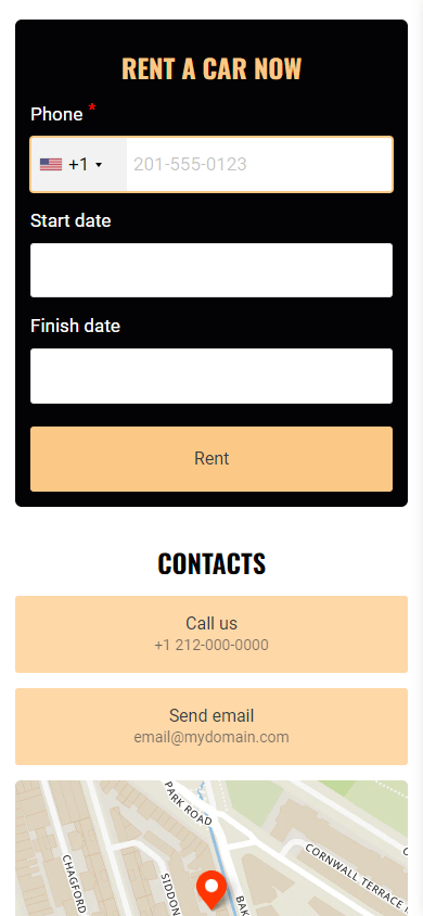
Example: Take a look at the screenshot below.
Follow the link to use this template.
The car rental service only asks visitors for the information that is necessary for the initial rental process. It includes a phone number to contact the customer to discuss the rental in detail, as well as the start and finish dates of the rental.
If you encounter any difficulties while creating the form on Taplink, refer to this comprehensive guide.
As we’ve discussed earlier, your entire landing page should be designed with one goal in mind: to motivate visitors to take action, or to click on your CTA button. This action could be anything from “Buy Now” to “Sign Up”, or “Contact Us”. The key is to make your CTA clear, persuasive, and easy to spot. Make your CTA stand out visually. Use contrasting colors, clear fonts, and strategic placement to ensure it captures attention and compels clicks.
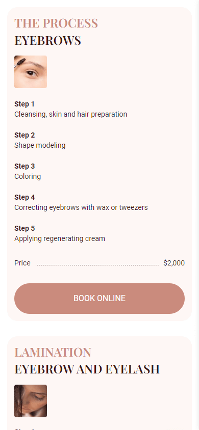
Example: Take a look at the screenshot of the landing page for the brow and lash studio.
This template is available here.
The landing page effectively utilizes a straightforward and easy-to-understand CTA for new customers — “Book Online”, while the button stands out against the background.
If you’re going to create your landing page on Taplink, you can also animate your primary CTA button. With 9 animation options available, you can make your CTA button even more eye-catching.
Show, don’t tell. Images grab attention instantly, set the tone for your message, and leave a lasting impression on visitors. Here’s how to leverage imagery to enhance your landing page:
- Prioritize high-quality: Opt for high-quality images that capture attention and effectively convey your brand’s message. Avoid using blurry or low-quality images that will make your page look bad.
- Focus on relevance: Ditch the generic stock photos and use images of your own product instead. To do this, you can either hire a professional photographer to take studio-quality photos and edit them. Or you can create product photos yourself, which will be much cheaper.
- Showcase value and benefits: Let your visuals tell a compelling story. Use images to showcase your product or service in action, highlighting the positive outcomes and benefits customers can expect.
- Consider emotional impact: Images can evoke powerful emotions, influencing visitor behavior. Choose visuals that create a positive emotional connection with your brand, such as happy customers using your product.
Example: Here are the illustrations on the landing page of the kindergarten.



Access this template here.
The first screen features a photo of happy children (emotional impact), while the second and third photos are authentic images of the teacher and the room in the kindergarten (high-quality and relevance). From the image depicting the learning process, parents can understand that their children will acquire new knowledge and have fun, spending time in an engaging and comfortable environment (value and benefits).
Taplink also provides a feature for creating image carousels, allowing you to display multiple images one by one. This will save space on your landing page and make it more interactive.
In this guide, you’ll find more information on how to add and customize image carousels on Taplink.
To make your landing page even more informative and engaging, you can add other elements for your small business requirements such as:
- Price list: to clearly outline your offerings
- Map: to show your location
- Videos: to visually show your products or services
- Social media buttons: to connect with your audience on their preferred platforms
- FAQ section: to address common questions and build trust with potential customers
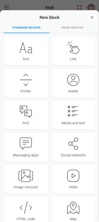
Taplink allows you to add up to 20 different blocks, including the ones listed above. Here, you’ll find any elements to meet any of your specific needs. By leveraging these features, you can maximize your landing page’s potential and drive your conversions.

Don’t settle for a generic look. Infuse your landing page with the colors, fonts, and visual elements that consistently represent your brand. This cohesive design approach will instantly connect with visitors familiar with your brand and establish a strong first impression for newcomers.
Creating a landing page on Taplink offers extensive customization options tailored to your unique business requirements. Here, you can customize every element of your landing page: background and button colors, button and form shapes, image size and format, animations to buttons, the number of sections, and much more.
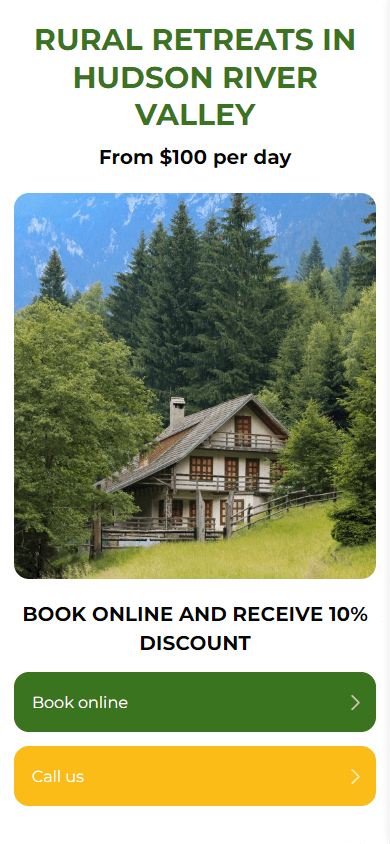
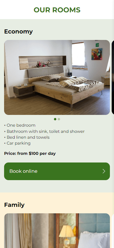
Example: Let’s examine how the below company incorporates its branding colors into its landing page.

Leverage this template from the link.
The brand’s signature colors are green and yellow, which are associated with nature and sunshine. Consequently, the company’s landing page maintains these colors in the background, on buttons, and CTAs.
Website builders, including Taplink, typically offer two options for creating a domain name: your own domain name or your landing page’s link hosted on the website builder’s hosting.
Using your own domain name is a great way to give your landing page a more professional and branded look. This is especially important if you want to make a good first impression on potential customers or partners. However, remember that you’ll need to purchase the domain and connect your landing page to it, which requires additional costs and time.
Using a landing page link offered by website builders is a simpler option as you don’t need to purchase it or connect a page to it. However, your link won’t look as unique or professional.
Whatever option you choose, here are some tips on how to make your domain name or link more memorable and effective:
- Use your business name. If you already have a business name, use it as your domain name or add it to your landing page URL. This will help people associate your landing page with your brand.
- Include keywords. If you don’t have a business name yet, you can include keywords related to your business in the link or domain name. This can positively impact search engine results, and your customers will immediately understand what your company does.
- Target your location. If your services are location-specific, be sure to add the city or region you serve in the URL. This will help customers understand the geographic area you target and also improve your search engine visibility.
Once your landing page is crafted and ready to go live, you should thoroughly test it to ensure a seamless user experience. This involves meticulously checking that all buttons work as expected and that submitted form data reaches its destination. Also test your landing page on as many devices as possible: phone, tablet, and computer.
Once your landing page is ready, it’s time to share it with the world! Here’s where and how you can do it:
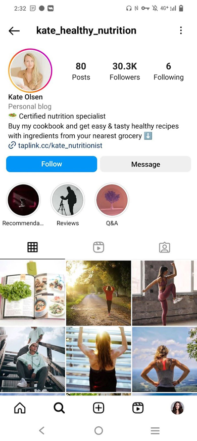
- Social media: Paste a link to it in your social media bio so that visitors can easily access it as soon as they land on your company’s profile. You can also craft engaging posts and stories on platforms like Facebook, Instagram, or LinkedIn to showcase your page. Embed the landing page URL directly into your content.
- Email: Add a link to your landing page in the email signature to ensure that as many recipients as possible are exposed to your product or service.
- Paid advertising: Run ads for your product or service on Facebook and Instagram to drive traffic to your landing page.
- Google Maps: Add the landing page URL as your website in Google Maps to enhance your local presence and visibility.
- Copy and conquer: Grab your landing page URL and paste it wherever your audience resides — Q&A websites, forums, or any online space where you have a presence.
- Physical materials: Promote the landing page of your small business offline using a QR code. If you’ve created your landing page on Taplink, simply download the automatically generated QR code. You can use it on a variety of media, such as brochures and flyers, signage, and product packaging.
Example: Here are some ways to include your landing page link across various platforms.


Once your landing page is live and has been running for a while, it’s a good idea to analyze its performance. By tracking user behavior and key metrics, you can optimize your landing page to achieve better results: refine content, design, or calls to action.
Example: This screenshot showcases the built-in Taplink analytics.

You can view the number of visitors who have landed on your page over a day, week, or month. Additionally, you can track the number of clicks on specific buttons and conversion rates.
Taplink also allows you to integrate with Google Analytics and other analytics tools for deeper insights into your landing page performance. Learn more about the additional modules you can connect to Taplink here.
Even the most meticulously crafted landing page can fall short of expectations. If your landing page isn’t delivering the desired results, investigate the following potential pitfalls and make necessary adjustments:
- Text overload: A cluttered landing page can hinder readability and make it difficult for visitors to grasp the core message. Remove any unnecessary text. If you have a long, unbroken paragraph listing items, convert it into a bulleted or numbered list. This will make your text shorter and easier to read.
- Lack of clear instructions: If a visitor doesn’t understand what you want them to do, they’ll simply leave. To make it more clear, use strong, action-oriented verbs like “Buy Now” or “Sign Up for Webinar”.
- Color clash: The color of your CTA button significantly impacts its effectiveness. Ensure your CTA color contrasts sharply with the page background to grab attention and encourage clicks.
- Font frenzy: Excessive fonts create visual chaos and detract from readability. Limit your font choices to two complementary options.
- Failing the “blink test”: First impressions are everything, especially for landing pages, where visitors make snap judgments within milliseconds. If your landing page fails to capture attention and convey its value proposition within the blink of an eye, you’re losing a valuable opportunity. Prioritize a clear and compelling headline, a strong visual, and a clear value proposition above the fold to capture attention instantly.
Now you have a roadmap to crafting a high-converting landing page for your small business. Remember, the key lies in understanding your audience, crafting compelling content, and guiding visitors towards a clear call to action. By following these steps and continuously optimizing your page, you can turn visitors into loyal customers.
Creating a landing page can feel overwhelming, but it doesn’t have to be. Taplink makes it effortless to put all the advice in this article into practice. Create a memorable landing page in 15 to 20 minutes with Taplink by following this link.