About Us page examples + templates

- How to create a great About Us page
- What you should add on your About Us page
- Good About Us page examples
- Introducing a brand with Faberlic consultant page example
- Use the video production example to focus on your portfolio
- About Us page example for a new brand
- Get About Us page template for your website
- The bottom line
A good brand description helps both customers and your business. A user, who’s just found you, wants to know who you are. You, on the other hand, probably want them to choose you above your rivals. That’s why you need to write who you are and what you offer shortly, introducing yourself in a favorable light.
To make your About Us page more demonstrable and persuading, we recommend that you:
- Use pictures and videos on the page. They raise more emotions in users, than plain text. Besides, pages with media files are easier to read.
- Be concrete. You can’t just say you do great and offer the best product at the best price, and you give all the profit to charity. If you do, though, give examples and proofs, the accurate numbers.
- Decide on your target audience. It determines what words you should use, what stories you should describe, and what you should emphasize. For example, a retail shop is focused on regular people, so it should use simple words and put emphasis on the high quality and prices. A wholesale shop’s audience includes specialists. That’s why it can use professional terms and put emphasis on subtleties of the field.
- Focus on your distinctions. Then, your About Us page will be unique. For example, you add a special ingredient in your product, or offer rooms merely in luxurious hotels. Devote more space on the page to them, highlight them using design tools.
Here is an example of what you can tell about yourself or your company on the page.
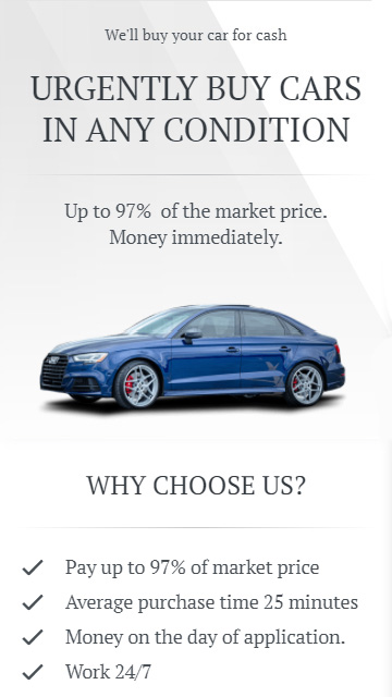
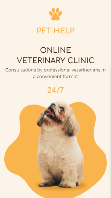
What you do. First, make it clear what your company does from the beginning of your About Us page. There is little chance that users get to your page by accident. And customers may still not understand clearly what they can buy.
For example, a user saw your photos of buildings, palms, and swimming pools. These could be ads or photos in your social media profiles from where the user went to your website. They may think you offer rooms in hotels. While you, in fact, offer beach house rentals. It’s always better to clarify it with a couple of sentences.
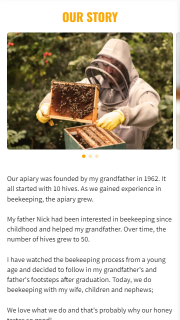
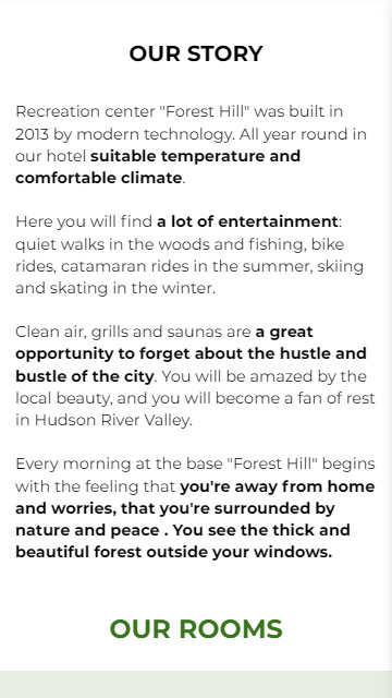
Your story. Brand storytelling is a good way to introduce your brand. Try to make your story engaging. Don’t turn your About Us page into a page from a history textbook.
Set a background and describe characters. As any narrative, your story should have its main point. Emphasize a momentous event, when you or your team successfully handled difficulties and arrived at success.
Work examples. It's better to see something once than to hear about it a thousand times. No matter how you talk up your products in words, a user certainly wants to see them too.
Add photos or videos with several of your best works or products on your About Us page. You can even repost them from your social profiles. For example, you can repost Pins, read the instructions in the article how to add Pinterest links to your Instagram bio.

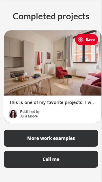
Show your team. Place photographs of your colleagues on the page, describe their duties at work and hobbies in life. Users will know which employee is responsible for each stage of production, and what kind of people work in your team. Your company will no longer be a bunch of faceless people, but it will be a group of personalities working on the orders. Thus, you increase customers' trust.
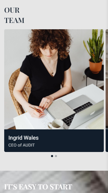

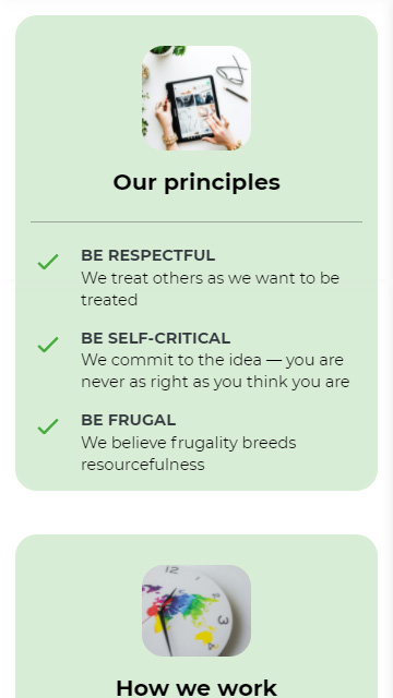
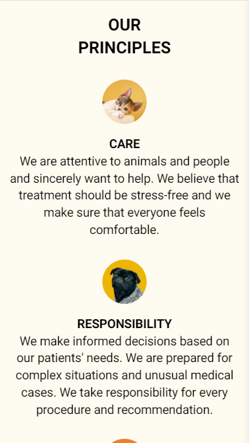
Principles and values. You may have lots of them, but you don’t need to include all of them in your About Us. Choose those, which will be most relevant to your clients and business partners. If they see that you appreciate and value the same things, they are more likely to choose you.
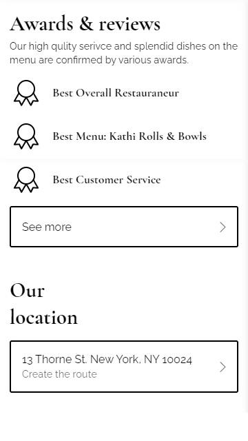
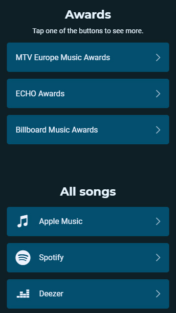
Awards. Industry, federal, and global recognition increases credibility. If experts from different cities and countries have agreed your product is good, it must be really good. So add them on your About Us page.
Reviews. People’s opinions are as important as the awards. Positive reviews may persuade users to choose you. But it works only if the reviews are real.
Place video reviews to show they are real, or you can provide links to the reviewers’ social media profiles. A video is tougher to fake than a screenshot with a text written by a marketer. It's a good way to gain customers' trust. As for the links to the profiles, a potential client can follow them to make sure that the reviews are left by real people.


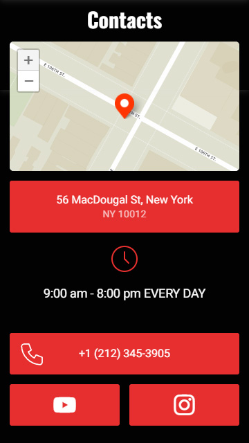
Contacts. Add your address with a map on your About Us page, so that people can easily find you. Place the phone number and links to your socials so that people can get through to you.
There are always clients who want to know more details before placing an order. Besides, some customers prefer placing an order in chats rather than from a catalog on a website. Give them what they need — link to your social profiles on TikTok, Twitter, LinkedIn and others.
For many users, active Facebook and Instagram accounts are a guarantee of credibility. If you work on your social media profiles, it means you care about your brand image and won’t put your reputation at risk. Thus, you are likely to solve a controversial situation in favor of a customer.
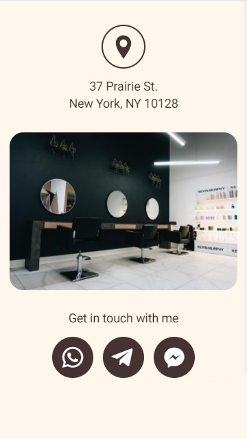
Write your offline address and complement it with a map. People will find you easier. Your potential clients from another city will appreciate this for sure.
Call to action. You don’t sell anything on your About Us page. But don’t miss the opportunity to make your potential clients into real ones. If a user’s got interested in your brand after reading the page, a hint where to look for your offer comes in handy. You can give a link to a catalog or examples of your works. If you don’t drop a hint, people have to think for themselves. And they may think up to close the website and go to your rivals.
Your page doesn't have to contain all these things. Write only what you can write about. The things differ depending on the case.
Let’s assume, you’ve just launched a small business. You sell chairs that you make yourself in a garage. You haven’t got any reviews yet, besides you work alone. So, you can’t place reviews or a list of colleagues. But you can place photos of the chairs as work examples.
Now let’s look at some examples of About Us pages made on Taplink. You can find the templates of the described pages on the service website and use them, or create your own page from scratch by the same link.
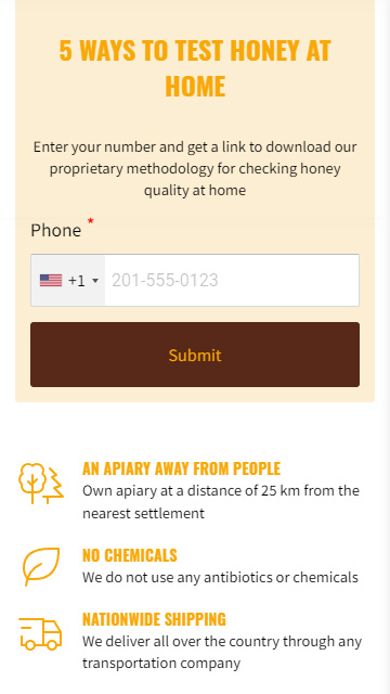
Whether you are popular or not, whether you sell your product or make money on an affiliate program — this About Us page example is relevant to you.
The first thing a user sees on the About Us page is the name of the brand. Right after it, there is a photo, which gives the impression of in-person communication. Then the consultant introduces herself, starting with "Hi" and saying her name, which is quite friendly. The page inspires trust and contributes to a dialogue.
Britney also says what kind of business she runs. She offers to teach how to buy cosmetics smartly. Faberlic is a popular brand, so she doesn’t need to specify what products she sells. If you are not that popular for now, you’d better write what products users can buy on your website.

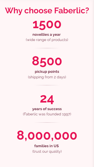
Next, Britney explains why you should choose this brand when buying cosmetics. She does it by providing facts about it. Note, she gives accurate figures and adds what the numbers mean for the users.
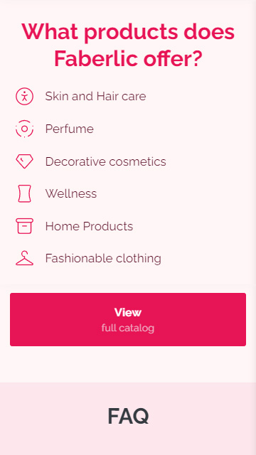
At the end of the About Us page, users can find types of products and a link to the catalog. This is the call to action that won’t let users just leave the page after finishing reading.
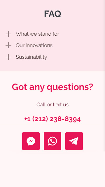
Then, Britney tells more about her business. She uses a FAQ, so a user can tap a line and read more detailed information. Those who are not interested can quickly scroll it down.
At the bottom, a user can find a section with contacts. Britney created and added WhatsApp, FB Messenger, Telegram chat links. She says it’s for those who still have questions.
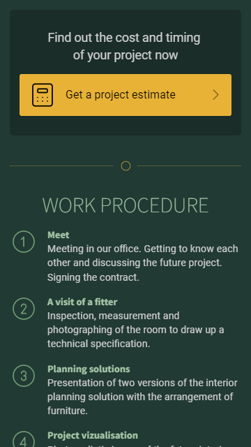
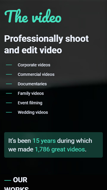
This is a video production company. It has a lot of great works and positive reviews. They are the focus of the About Us example.
The page starts with a list of video productions the company offers. They are reposted from the brand's YouTube channel. These videos give clients an understanding of what they can get and if they should approach the company.
Then, the company tells about its video production experience. It added accurate numbers, which are 15 years and 2,000 videos.
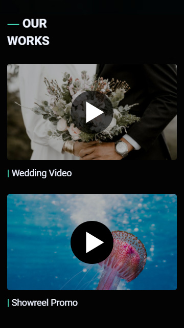
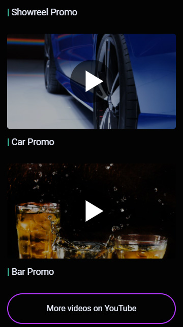
Work examples placed next are an opportunity for the company to show the quality and variety of their projects. Below is a YouTube button, clients can follow it to watch more videos with the examples.
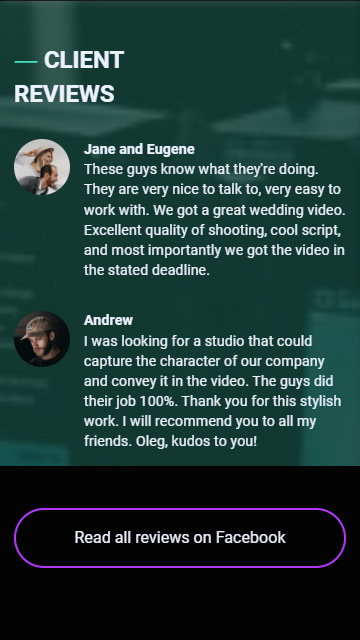
The company also placed the reviews. On their About Us, each reviewer has their photo and name. Besides, clients can tap the button below and read more on Facebook. All this ensures the reviews are real, and inspires trust.
At the bottom, users will find contacts and links to socials. They are for the clients who want to ask a question, and for cooperation.
If you’re a video creator using Instagram to market your services, check these inspiring Instagram bio ideas for video creators.
At the beginning of the article, we described an example of a business started a while ago. There the entrepreneur had no history, no reviews, only the idea. Now we will give an example for such cases.
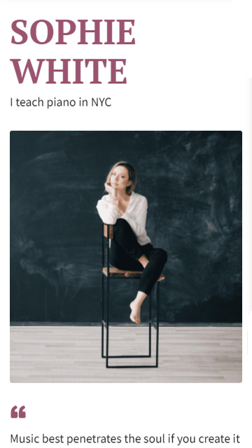
Sophie White teaches to play the piano in New York. This is how she starts her About Us page, and then she adds her photo. Under the photo, there is a beautiful quote. It characterizes Sophie as a romantic person. And this is exactly what a piano teacher is associated with. Thus, a user gets to know the teacher, and you, just like in the first example with Faberlic, gain consumers' trust and favor.

After that, Sophie tells more about her lessons. Users can scroll to the side and see that there are personal and group lessons. There are short descriptions to each of them which are enough to make a decision.
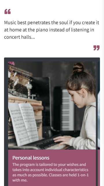
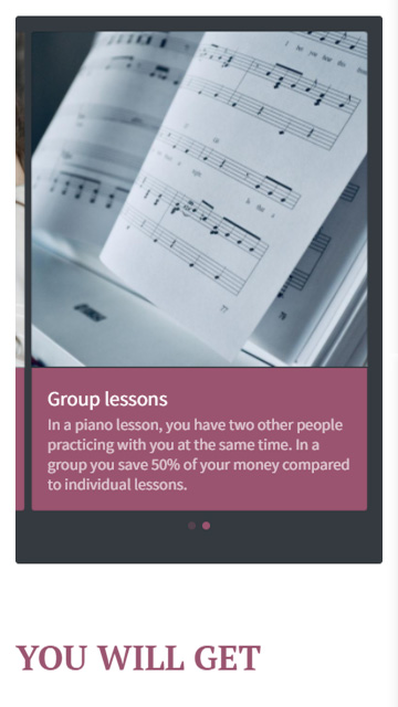
Then the teacher explains what her students get by choosing her lessons. She focuses on her advantages.
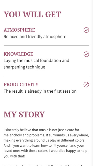
In the following My Story section, Sophie dedicates half of the text to describing the meaning of music in her life. This inspiring passage will attract the attention of her target audience, the people who are as creative and romantic as she. After that, she tells about her skills and work experience. Sophie’s graduation and teacher experience will persuade people that she can teach them.
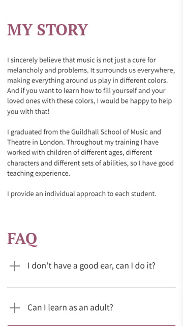
At the end of the page, Sophie placed additional information about her courses in the form of FAQ. There are two most popular questions that Sophie answers.
There is also a call to action on the About Us page. It’s a suggestion to attend a trial lesson.
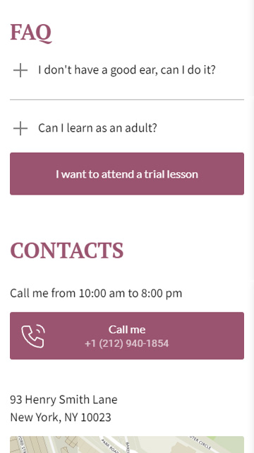
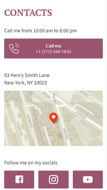
The contacts’ section starts with a button "Call me". When a user taps it, a default app for making calls opens on their phone. The number is already dialed. Thus, the user can make a call in two taps. And the easier it is to make an action, the more likely a user will make it. Here it means they will call if there are doubts.
There is also the school address and the map. Users can move around it, zoom it in and out, so it’s easier to navigate.
The teacher also added links to her social media profiles. This is one more way to contact her, know more about the teacher and her skills.
All the described About Us pages are made on Taplink. The service has more than 20 categories of page templates for small and big brands from various fields: sports, nutrition, rent, photography and videography, etc. Each template was made by designers and marketers, considering the specifications of industries.
You can choose one of these ready templates, edit them, or create them in your own design. In the editing menu you will find all elements that you saw in the described About Us pages, and also many others like songs and playlists, or a timer.
Here are templates of the About Us pages that we show above. Follow the links to get them after a sign-up:
Whatever you sell, you need an About Us page. It should answer the two main questions, which are "What does your business offer?" and "Why should a customer or supplier choose you?".
Use About Us page examples as a base for creating your own. If you don’t have time for it, use a ready template. On Taplink, there are templates for more than 20 business fields.
You can also make a business website on Taplink. It's as simple as creating a page describing your brand.