Taplink blocks: Review
Read the full overview or go directly to a specific block:
Blocks in Taplink are the basic elements that make up a page; for example, text, images, videos, contact forms, lists, etc.
Below is an example of such a page.
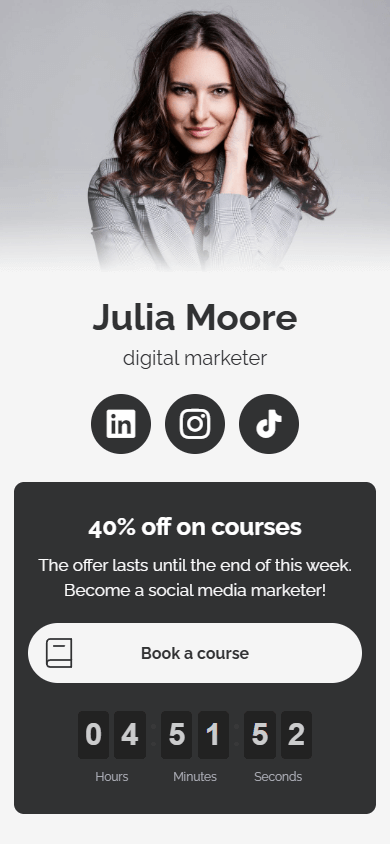
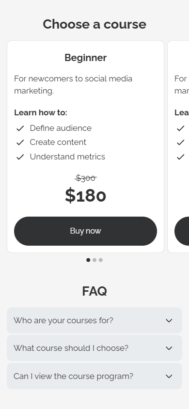
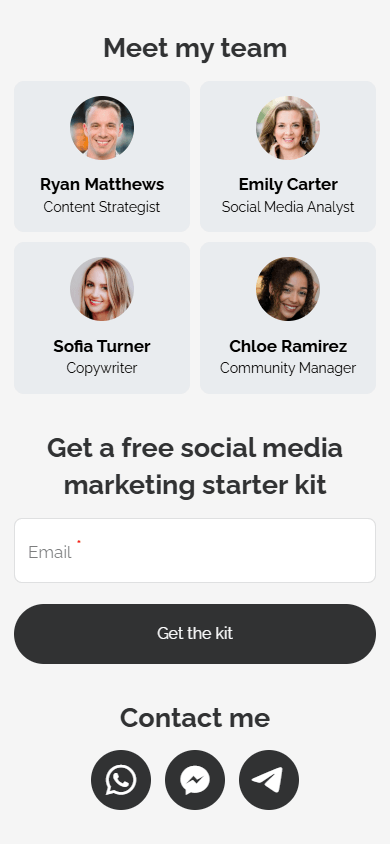
There are more than 20 blocks in Taplink.
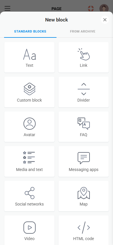
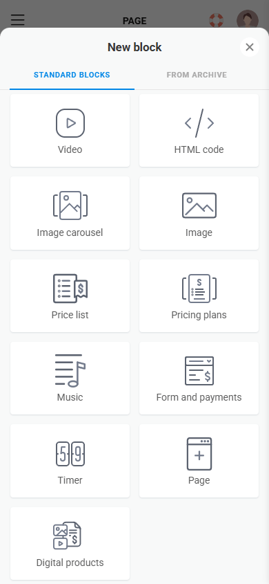
Below, we’ll take a look at how you can use each block and how you can customize them.
Using the Text block, you can describe your business, products, or services, list your advantages, achievements, the stages of your work process, or encourage visitors to take action.
The Text block can be used as:
- Titles and headings.
- Descriptions.
- Lists.
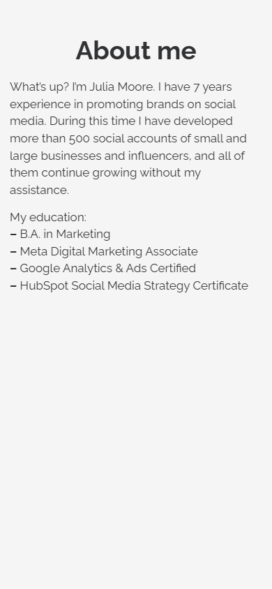
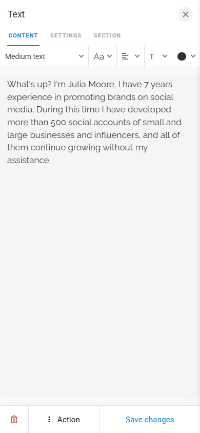
There are no limits on text length in Taplink.
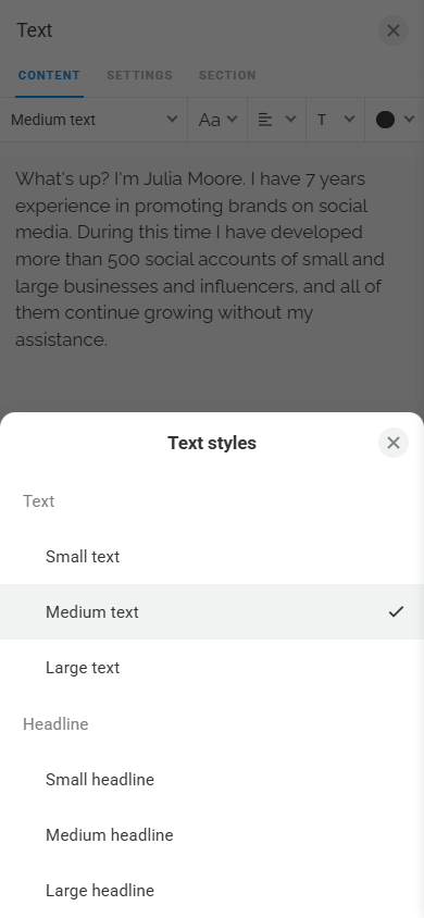
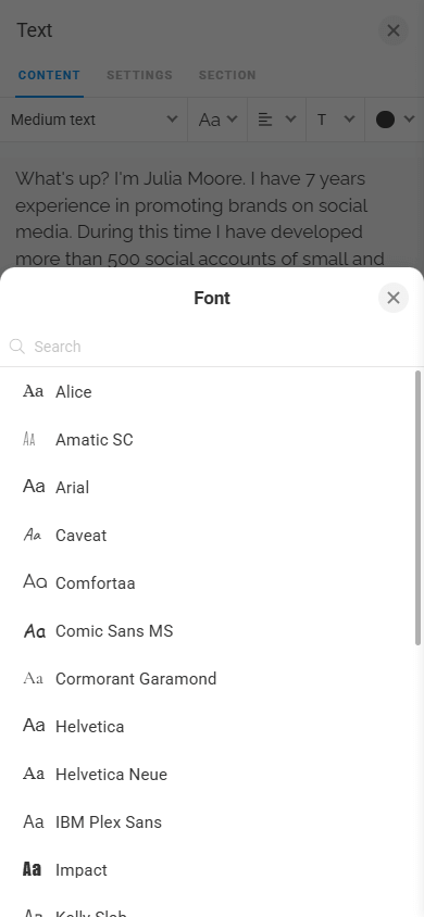
To make the text match your page design, you can adjust its style, font, alignment, formatting, and color in the design settings.
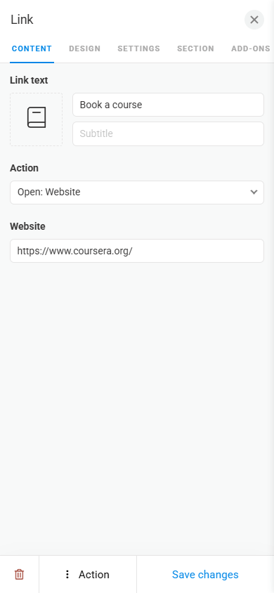
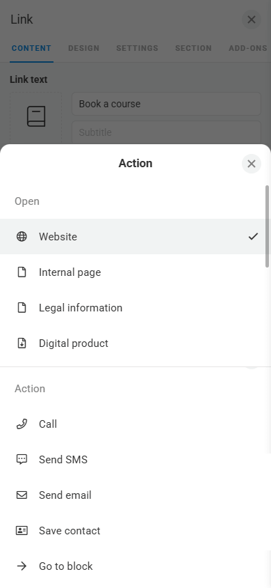
The Link block allows you to add a button that leads to an external platform or performs another click action.
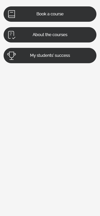
As a click action, you can choose:
- Go to an internal page.
- Open the page with your digital product.
- Make a call.
- Send an SMS.
- Send an email.
- Save your contact details.
- Go to a specific block.
- Open the newsletter subscription form.
- Expand the content of the internal page in the same window.
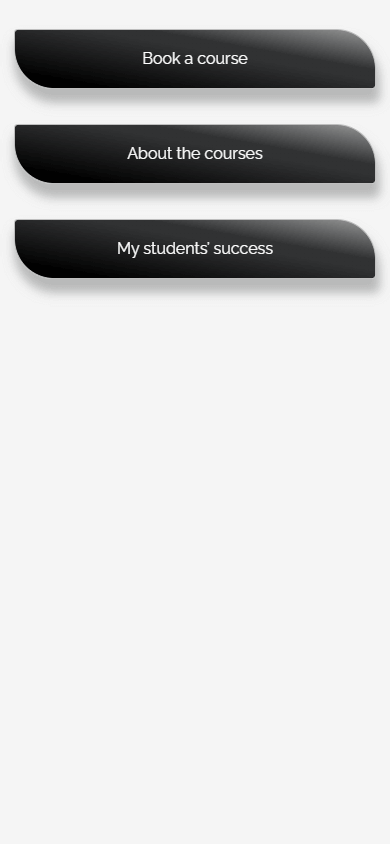
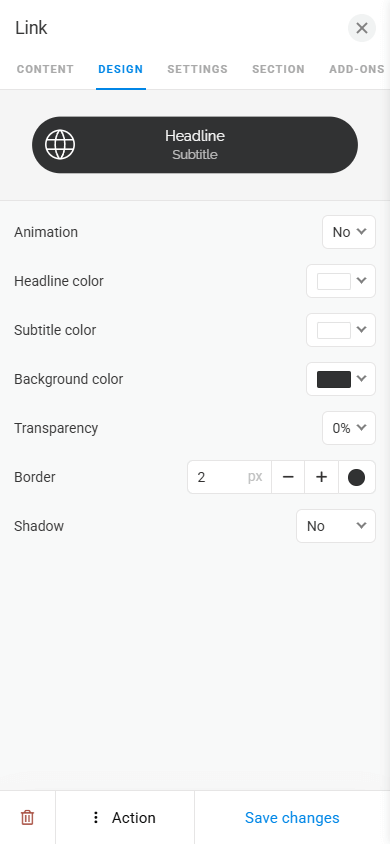
You can also customize the button appearance by animating it and adjusting the border, background color, text color, transparency, and shadow.
The Custom block is a professional editor built into Taplink that allows you to create unique blocks with your own design. It works like popular graphic editors, but it’s easier, more convenient, and available directly in Taplink.
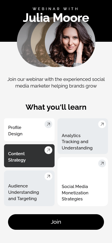
The Custom block allows you to bring ideas of any complexity to life, including a creative hero section, your advantages with custom layouts, unique link designs, etc.
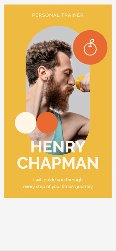
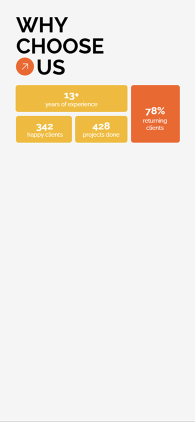
You can create a block from scratch or choose one of 90+ ready-made templates.
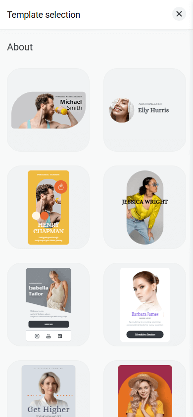
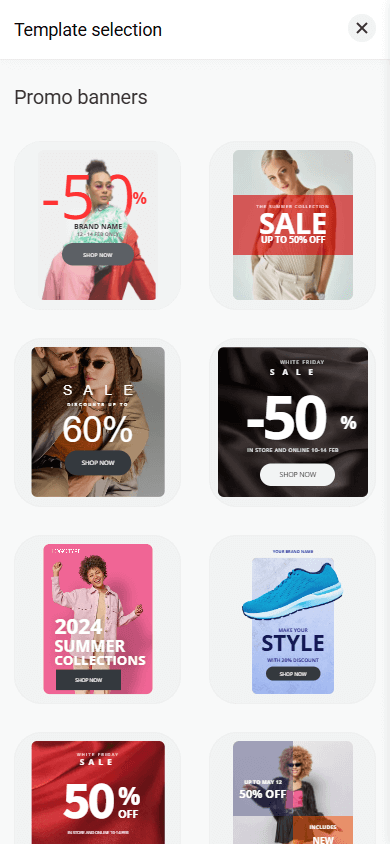
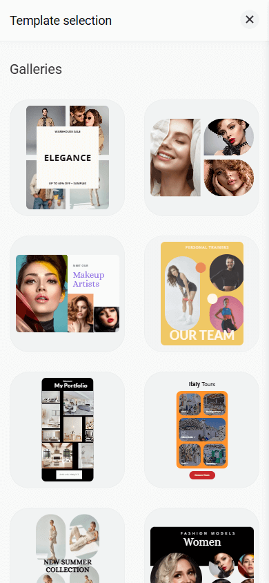
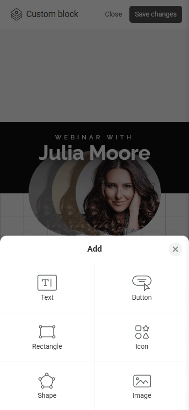
To create a block, you can use the following elements:
- Text.
- Button.
- Icon.
- Rectangle.
- Shape.
- Image.
All elements are arranged on a modular grid. You can freely move them within the grid, resize them, and layer them on top of each other.
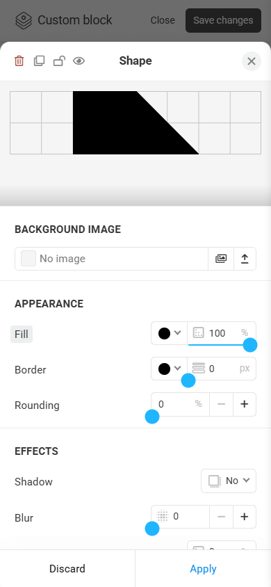
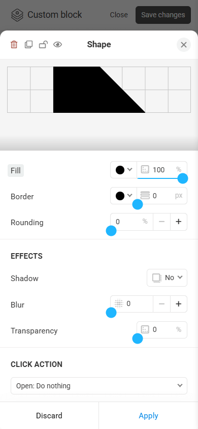
You can also fine-tune the parameters of each individual element. For example, the Shape element includes settings for fill, border, rounding, shadow, blur, transparency, and click action.
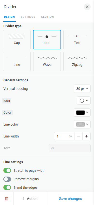
With the Divider block, you can separate content on a page and make it easier to perceive.


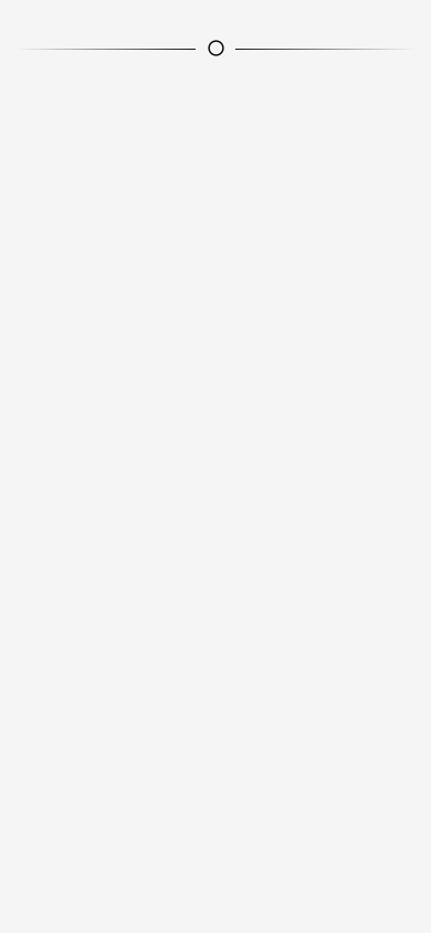
There are 6 divider types:
- Spacing.
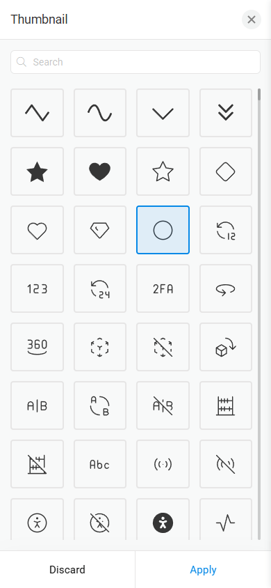
- Line featuring an icon.
- Line featuring text.
- Straight line.
- Wavy line.
- Zigzag line.
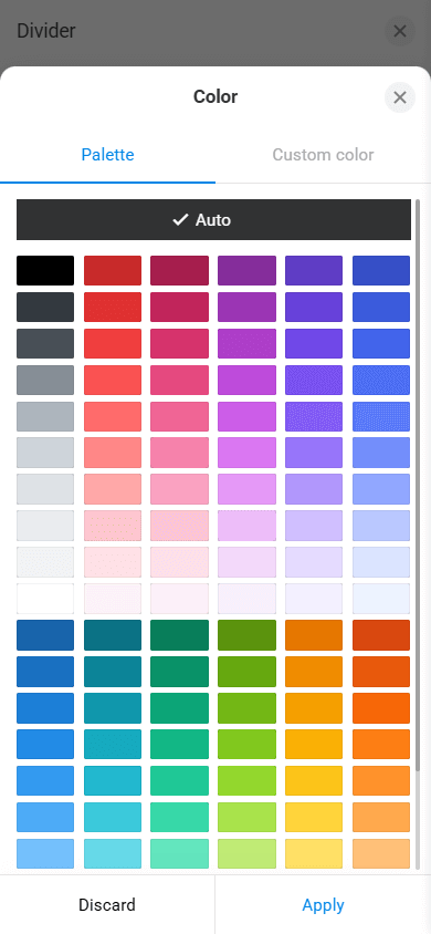
The Divider offers flexible design settings. You can adjust its height, width, color, edge transparency, and other parameters.
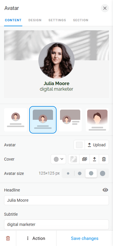
The Avatar block is a profile image that shows visitors who owns the page immediately. As an avatar, you can use a personal photo or your business logo.
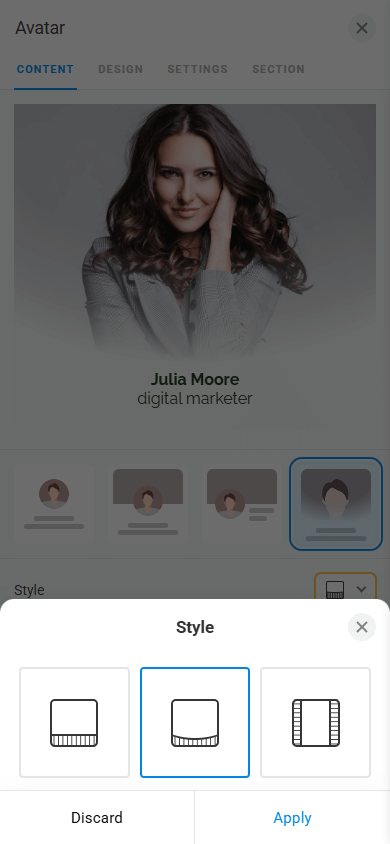
Taplink provides several avatar formats:
- A single image.
- An image with a cover.
- A hero image.


The block allows you to adjust the size of the image and the cover. As the cover, you can set a specific color, upload a photo, or choose a ready-made option from the library.
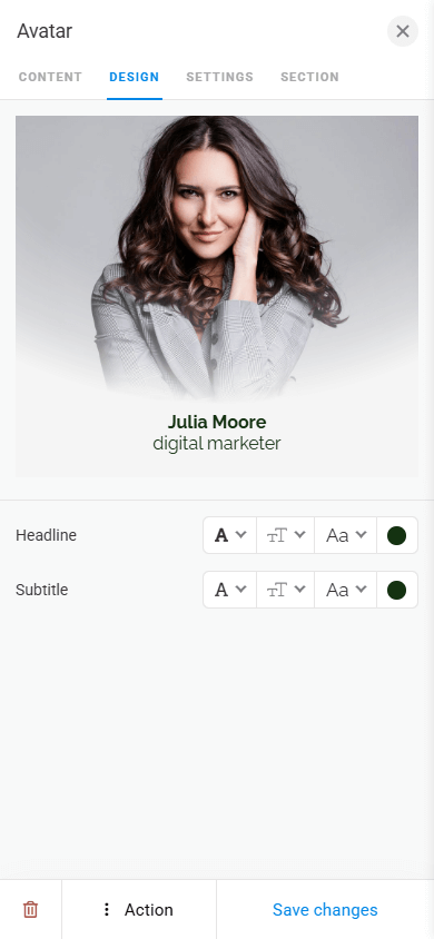
You can also add a title and a short description to the avatar. Text customization options include font, color, weight, and size.
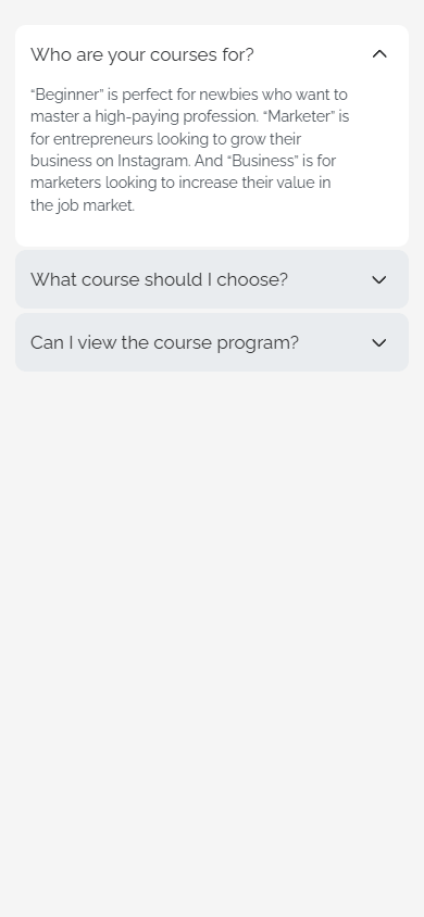
The FAQ block helps address frequently asked questions, reducing the number of requests and making communication with visitors easier.
You can also use it to compactly display extensive information. For example, you can list your work process stages, advantages, or cooperation details. Visitors will only see the headings and can expand specific items if necessary.
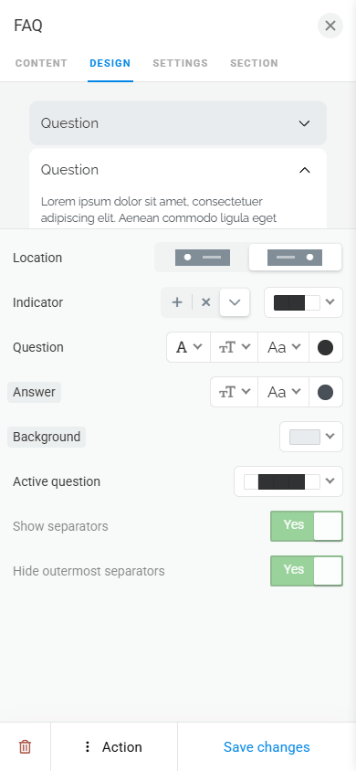
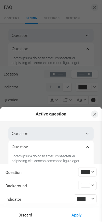
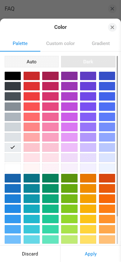
In the block design tab, you can configure the appearance of each element in detail, including expand icons, questions, answers, and the background for both expanded and collapsed questions and answers.
The Media and text block helps display information in a clear and structured way. With this block, you can neatly display competitive advantages, customer testimonials, quotes, introduce your team, and more.
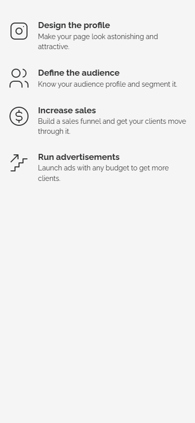
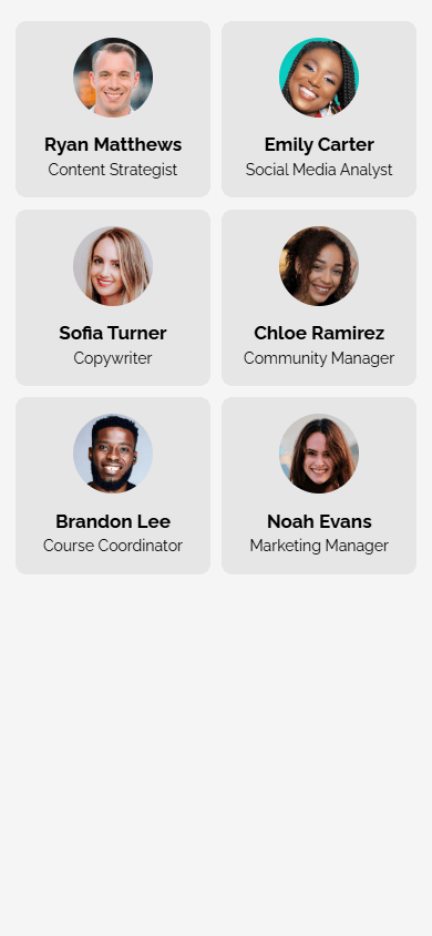
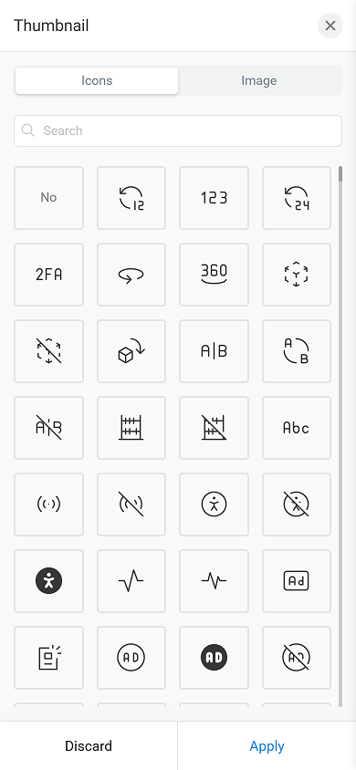
As media, you can use your own image or choose an icon from the built-in library.
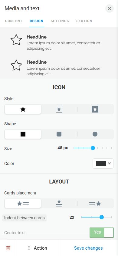
The block design is easy to adapt to the page style: you can customize the overall appearance of the block as well as separately adjust icons and text by style, shape, size, and color.
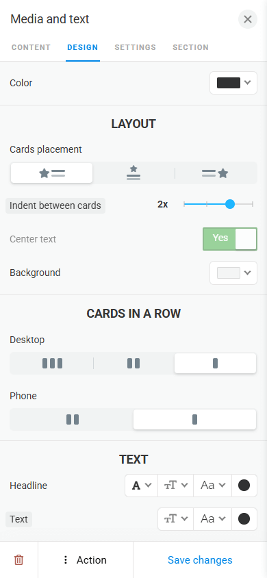
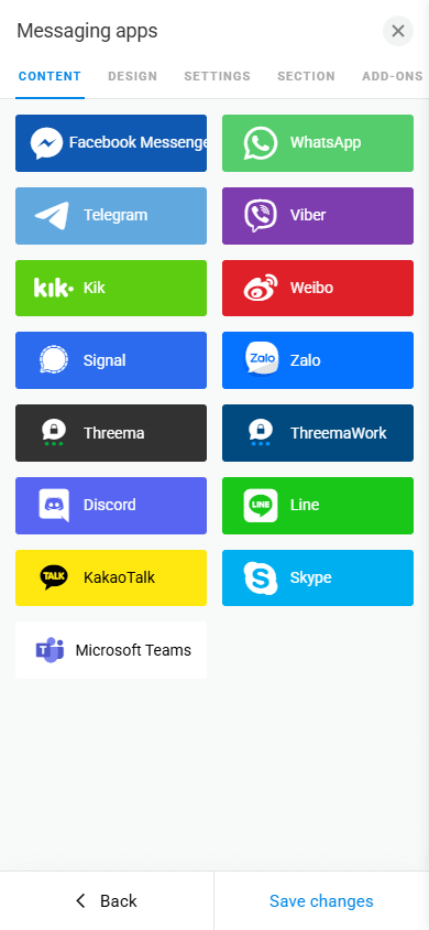
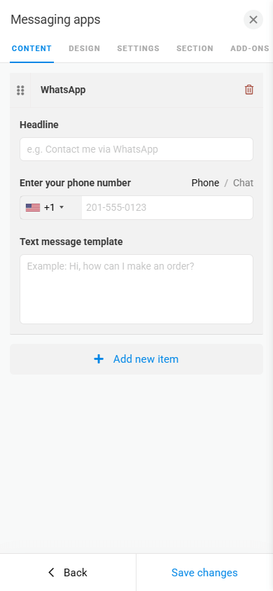
The Messaging apps block allows you to add buttons that lead to a chat with you in any of the 10+ supported messaging apps.
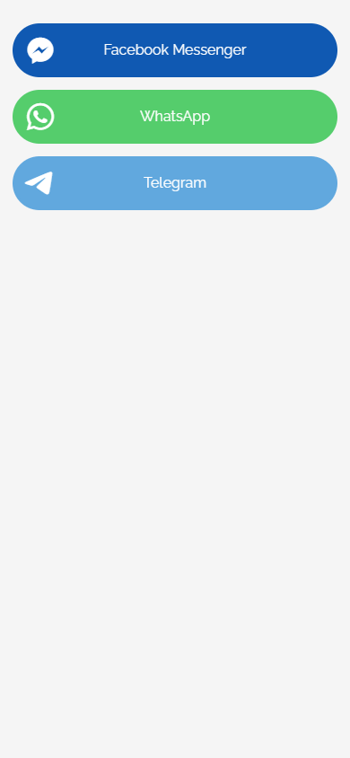
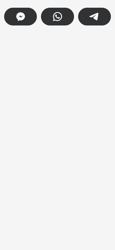
If necessary, you can set up a message template. This way, the text will automatically appear in the customer’s input field when they open the chat. This helps them speed up and simplify communication with you.
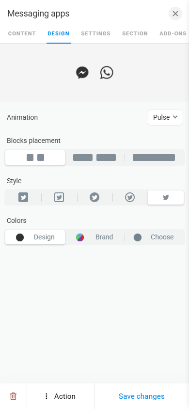
To make the buttons visually consistent with your page, you can customize their design. You can animate them, change their size and style, or adjust the background color, text color, and shadow.
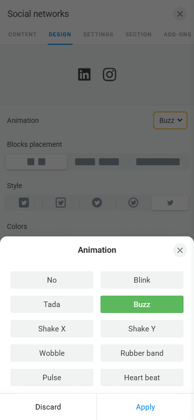
The Social networks block allows you to add buttons to the page for quick access to your profiles on different social media.
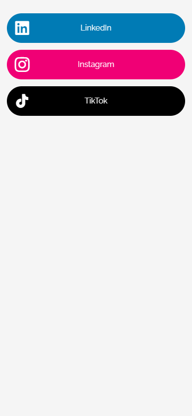
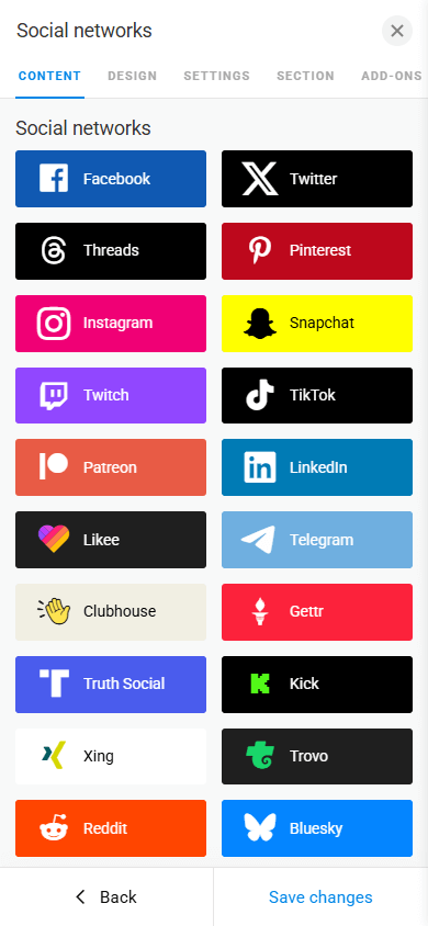
Taplink offers 70+ social media platforms. For easier navigation, they are grouped into categories, from standard social networks to music streaming platforms and gaming marketplaces.
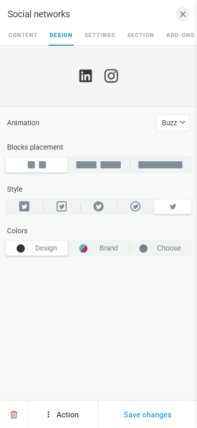
In the design settings, you can animate the buttons, change their size, style, and color.
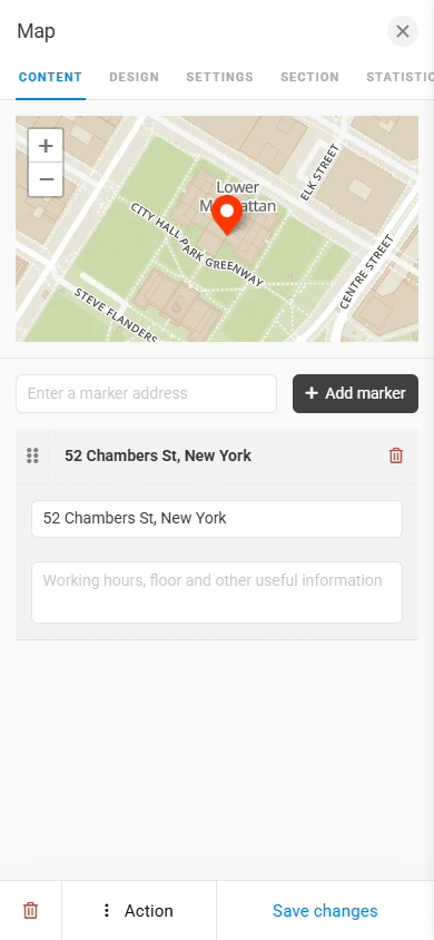
The Map block allows you to show your business location on the page. The block supports adding both a single point and multiple points on the map.
In addition to your business location, you can also use the Map block to mark any other locations you need. For example, musicians can mark their concert locations, real estate agents can show available properties, while travel bloggers can display visited cities or countries.
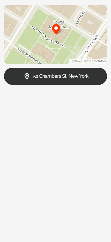
The block includes a map and an address button. By tapping the button, a visitor is redirected to Google Maps and can immediately build a route to the marked location.
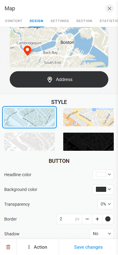
Both the map and the button can be customized. You can select a map style and adjust the button color, transparency, and shadow.
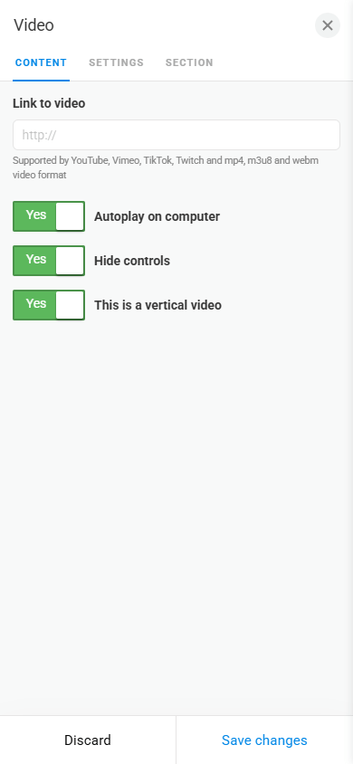
The Video block can be used to announce an event, showcase products and services in action, display promo videos, or share messages from business representatives.
Taplink allows playing videos directly on the page without redirecting to external platforms.
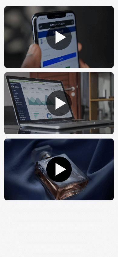
You can add videos from:
- YouTube.
- Vimeo.
- TikTok.
- Twitch.
- Hosting server.
You can customize the horizontal or vertical display of the video. And also enable autoplay on the page.
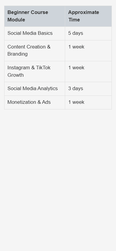
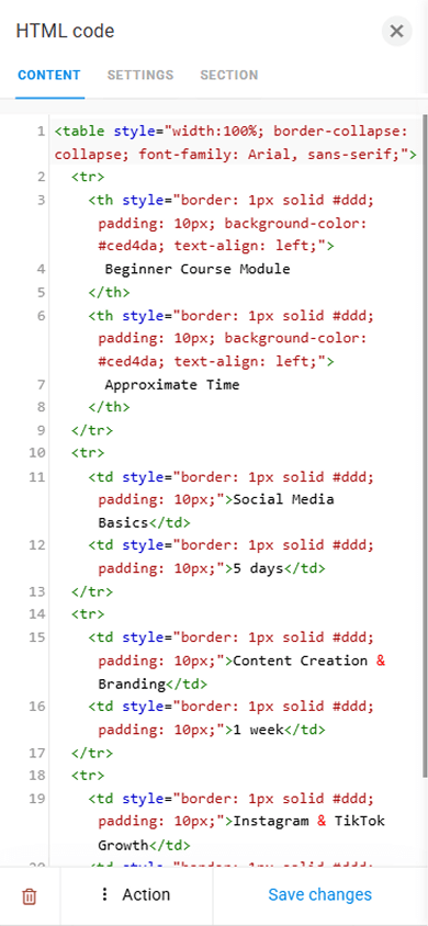
The HTML code block allows you to implement custom functionality on your Taplink page. For example, you can embed third-party widgets, add animated images, tables, and anything else you’d like.
The Image carousel block helps you display multiple images that can be swiped through. This allows you to show more information compactly.
You can use the Image carousel to showcase products, services, portfolios, before-and-after comparisons, step-by-step visual instructions, or to introduce your team.
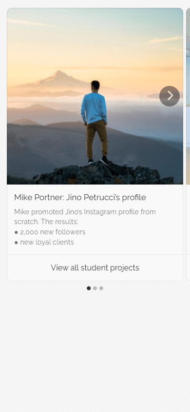
The Image carousel block supports up to 15 images.
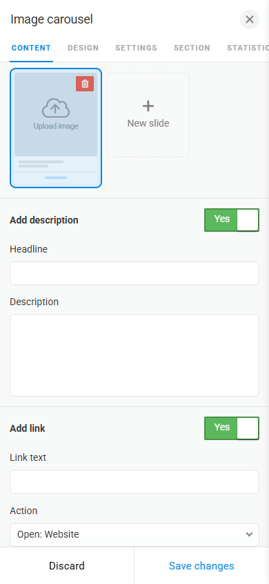
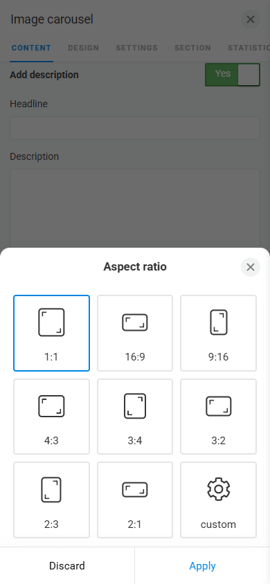
As for the design, you can adjust the image size, add descriptions, and display a button. The button is useful when you, for example, showcase your products and would like to add a link to a platform where visitors can purchase them.
In addition to linking to an external platform, the button can perform other actions:
- Go to an internal page.
- Open the page with your digital product.
- Make a call.
- Send an SMS.
- Send an email.
- Go to a specific block.
You can also enable automatic image scrolling on the page, if needed.
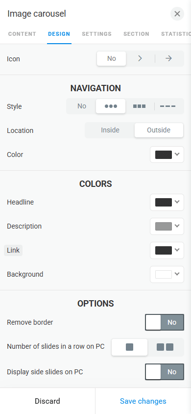
The block design can be customized in detail, including headings, text, buttons, as well as swipe and navigation icons. You can also configure how the carousel is displayed on desktops.
The Image block helps add a single image to your page. You can use it to display your product, your venue interior, a promotion, a chart, or a graph.
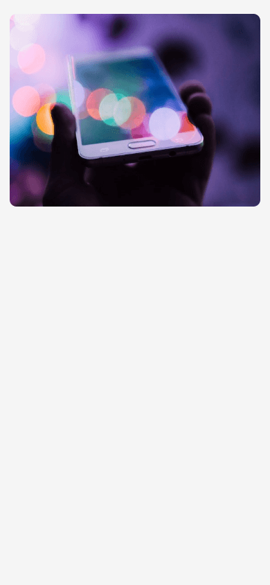
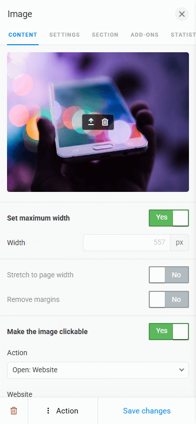
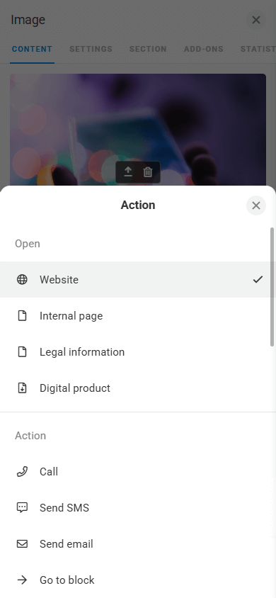
You can make the image clickable by either linking to an external platform or performing another click action. For example, you can select the following options:
- Go to an internal page.
- Open the page with your digital product.
- Make a call.
- Send an SMS.
- Send an email.
- Go to a specific block.
You can also set the image size or stretch it to the full page width.
The Price list block allows you to showcase your services and their prices in an attractive layout.
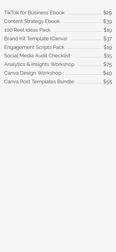
The currency is set automatically based on your location, but you can change it in the page settings if needed.
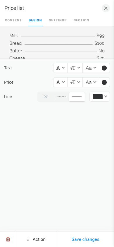
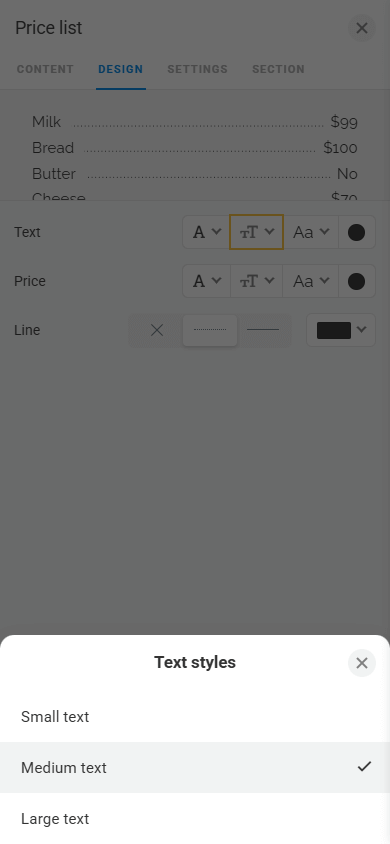
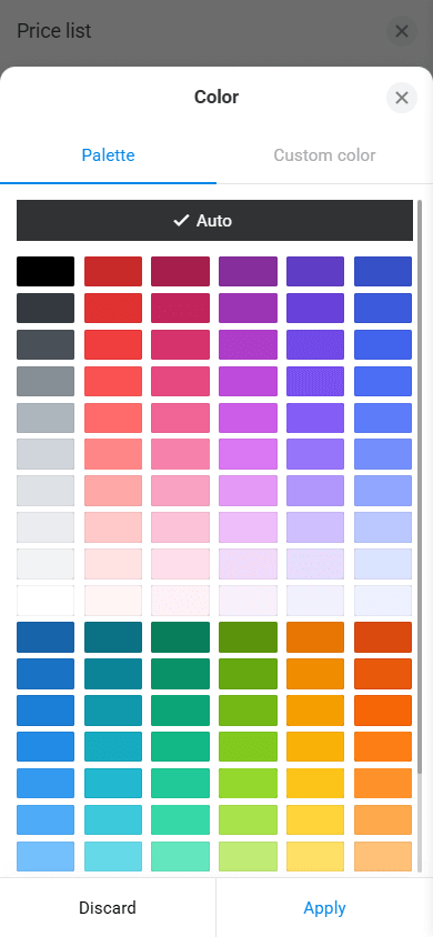
To customize the block appearance, you can adjust the font, style, weight, and color of the text, as well as the style and color of the leader line.
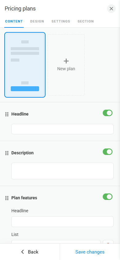
The Pricing plans block is designed to display pricing tiers and package offers in a carousel format. Compared to the regular price list, it emphasizes the differences between plans, makes them easier to compare, and immediately guides visitors to purchase using the built-in button.
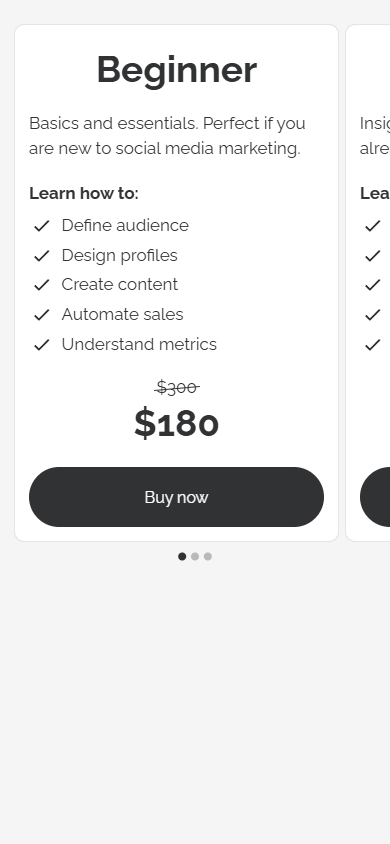
In Taplink, you can add up to 15 plans to a single carousel.
Each plan can include:
- Heading.
- Description.
- Plan features.
- Price.
- Action button.
You can change the order of these elements. For example, you can display the price first and then list the plan features, or vice versa.
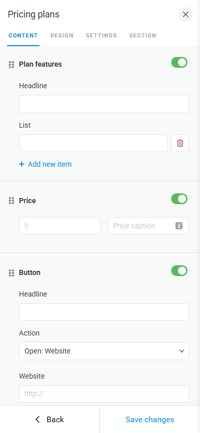
For the button, you can set the following actions:
- Open an external website.
- Go to an internal page.
- Open the page with your digital product.
- Make a call.
- Send an SMS.
- Send an email.
- Go to a specific block.
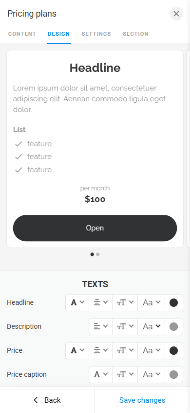
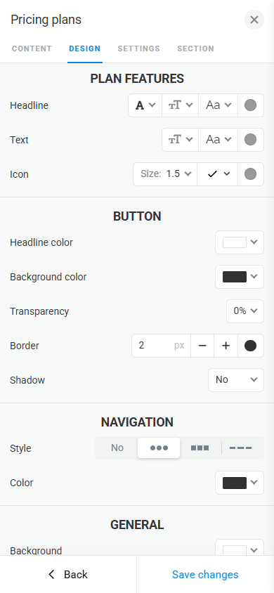
The block design can also be customized. You can fine-tune text, buttons, navigation icons, and background.
The Music block allows you to add tracks, podcasts, audiobooks, and other audio content directly to the page without redirecting to external platforms.
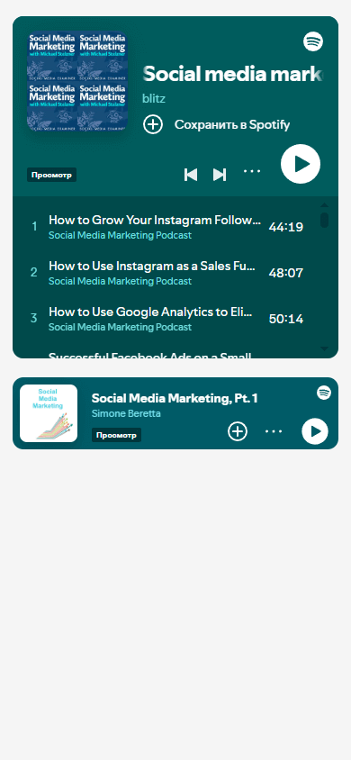
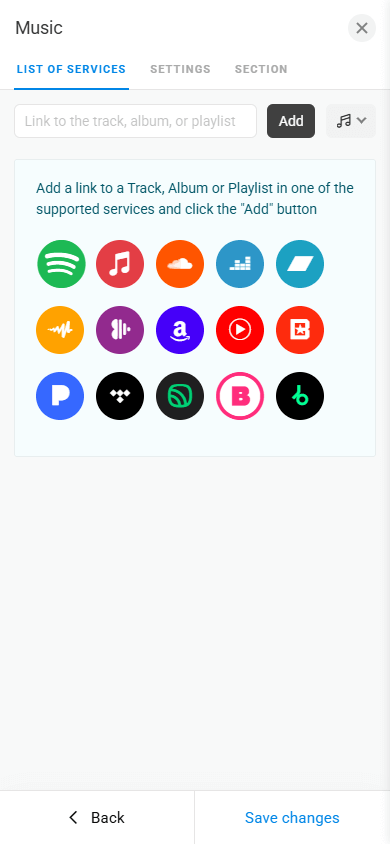
With the Music block, you can add not only individual tracks but also entire albums and playlists.
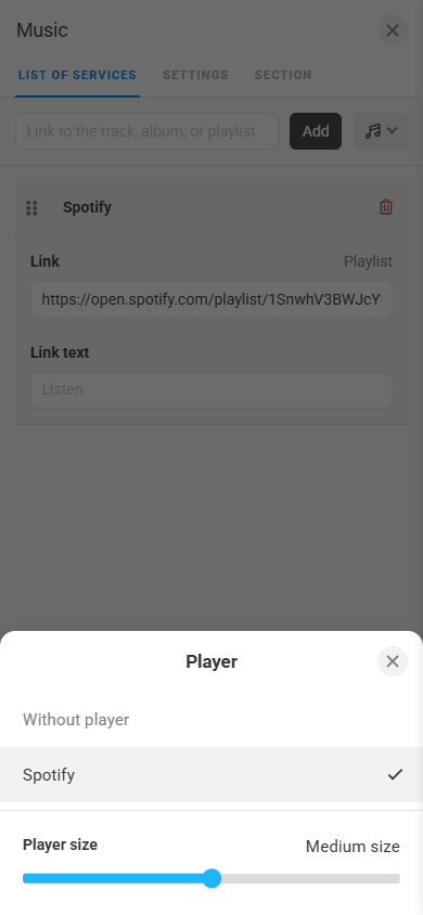
Taplink supports 15+ streaming platforms, including Spotify, SoundCloud, Apple Music, and more. The number of tracks you can add to the page is unlimited.
The player size is adjustable — you can make it small, medium, or large.
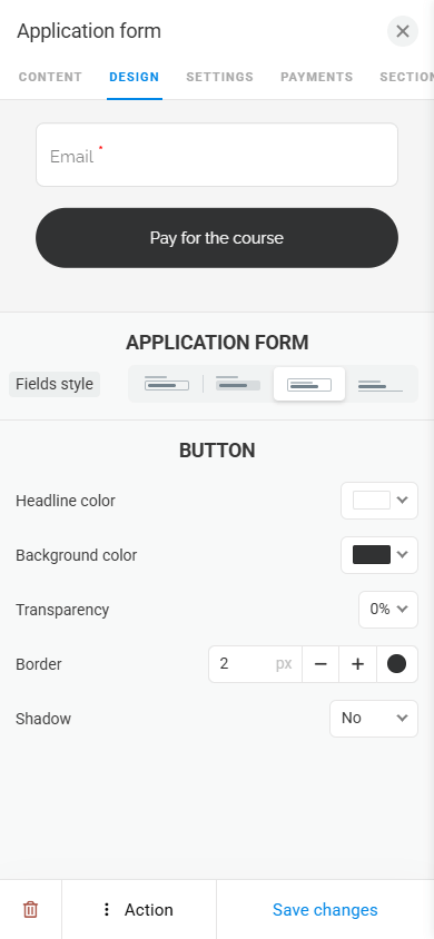
The Form and payments block is designed for collecting requests and accepting payments directly on the page. Using it, page visitors can sign up for a course, book a table, request a consultation, or pay for a service.
Form and payments can also be used to offer a freebie in exchange for visitors’ contact details.
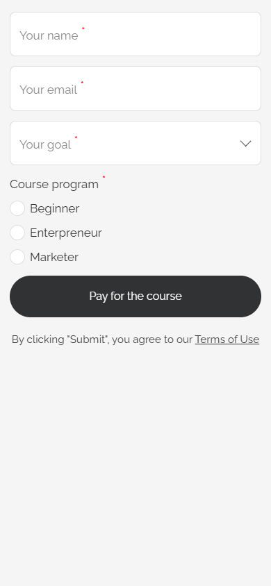
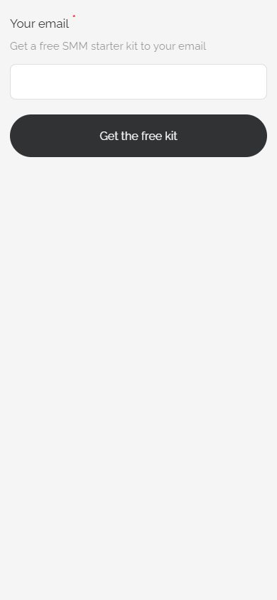
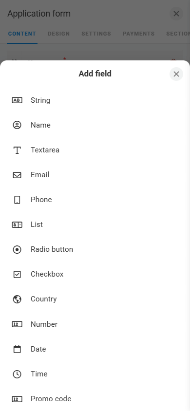
The Form and payments block can include either a single field or multiple fields. Taplink offers 10+ field types, including phone number, email, country, date, time, list, and others.
You can mark specific fields as required if necessary.
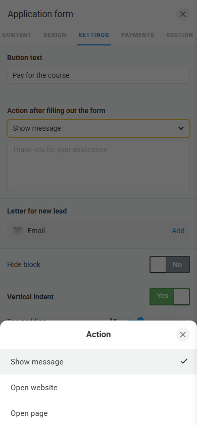
You can set an action that is triggered after form submission:
- Show a message.
- Open an external website.
- Open an internal page.
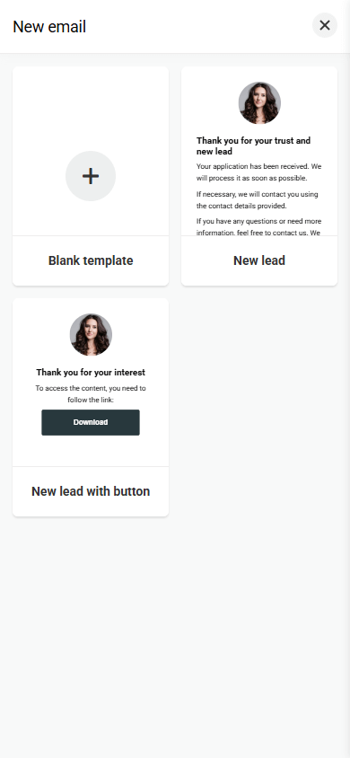
To set up automatic email delivery to the customer, you can use a template or create an email from scratch. The email will be sent once the customer submits the form or makes a payment.
The block design is customizable. You can adjust its style, colors, transparency, and shadow.
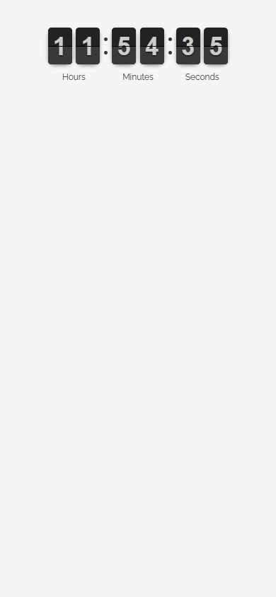
The Timer block is a countdown timer used to increase conversion rates and create a sense of a limited offer. It helps encourage visitors to take action, such as signing up for a course, purchasing a product, or submitting a request.
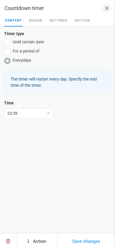
In Taplink, you can select how the timer operates:
- Until a specific date.
- For a specified period after the customer’s first visit.
- Daily, with automatic reset at a specified time.
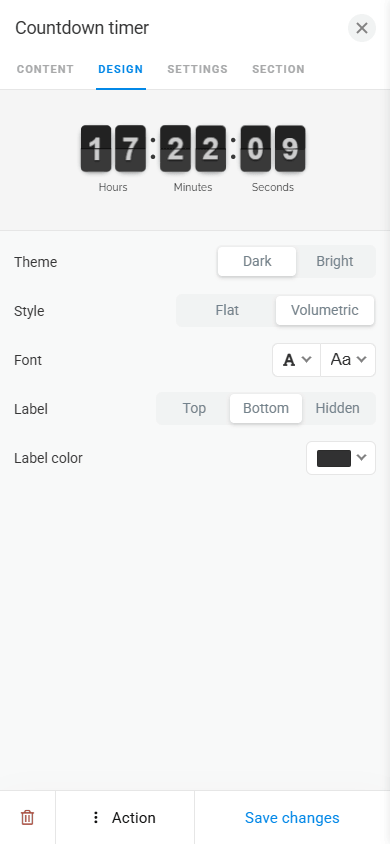
In the design tab, you can change the timer color theme and style, as well as customize the font and labels.
The Page block is an internal page. It helps offload the main page, making it shorter and easier to navigate. On internal pages, you can showcase your portfolio, share more details about your business, or describe specific products or services. Using several internal pages, you can build a complete multi-page website.
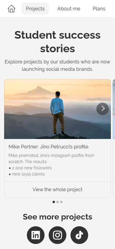
An internal page uses the same design as the main page. Adding blocks works the same way as on the main page.
In Taplink, you can add up to 512 internal pages.
If you create many internal pages, you can use a navigation menu for easier navigation across your website.
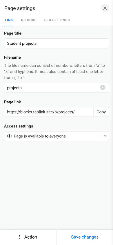
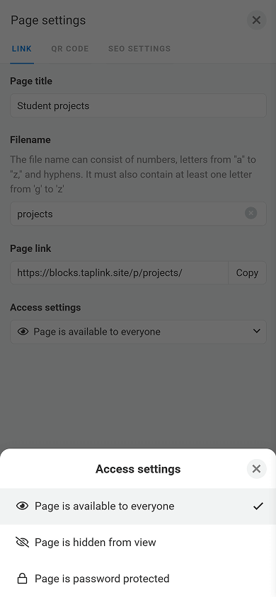
For each internal page, you can create its name, customize its link, and adjust the access settings.
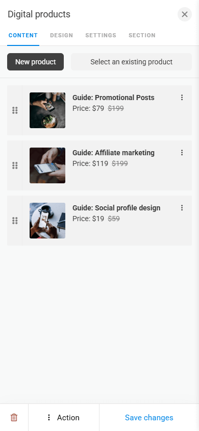
The Digital products block allows you to sell guides, courses, templates, e-books, audiobooks, and more directly from your page.
The product is automatically sent to the customer’s email right after they pay for it.
Taplink’s commission for digital product sales is 0%.
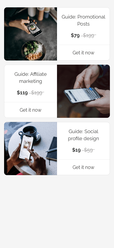
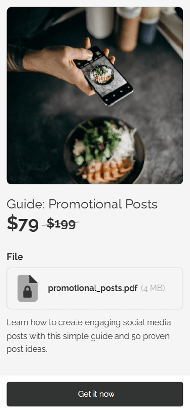
To the Digital products block, you can add:
- Product name.
- Description.
- Promotional and original prices.
- The digital product itself.
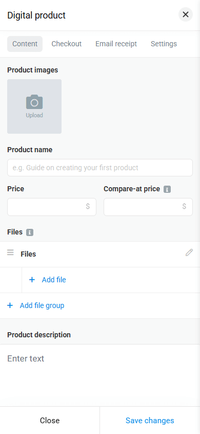
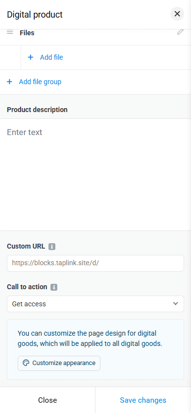
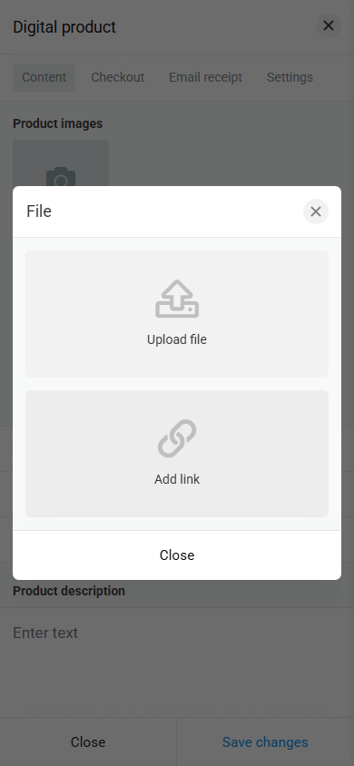
You can add the product in a way that is convenient for you by either uploading it as a file or providing a link to it.
To accept payments, Taplink supports 60+ payment providers, including Stripe, PayPal, Revolut, and many local ones. This allows you to accept payments from customers worldwide.
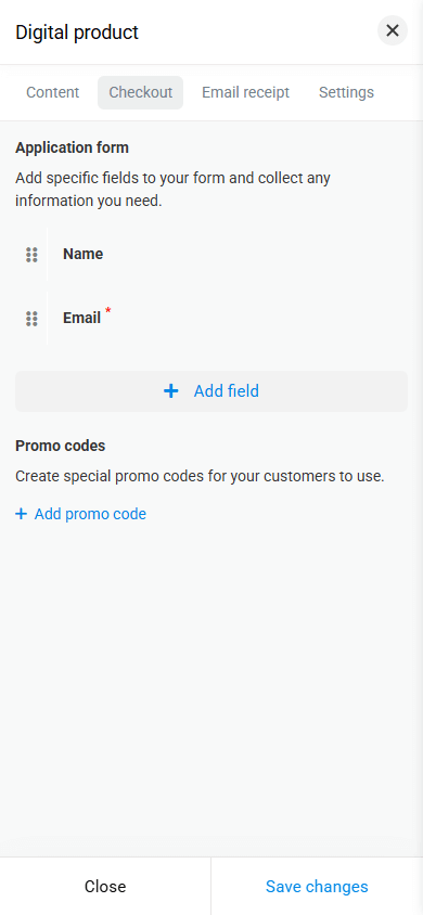
The form that your customers need to fill out is customizable. You can select fields, as well as add a promo code field if you provide one.
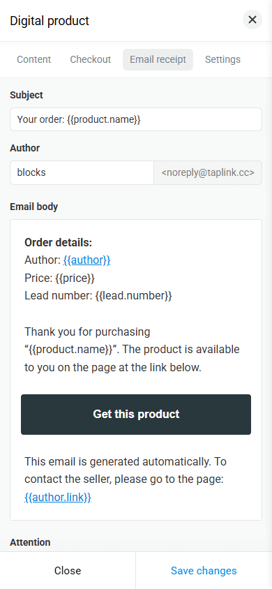
You can also configure a receipt, which is automatically sent to your customers once they make a payment.
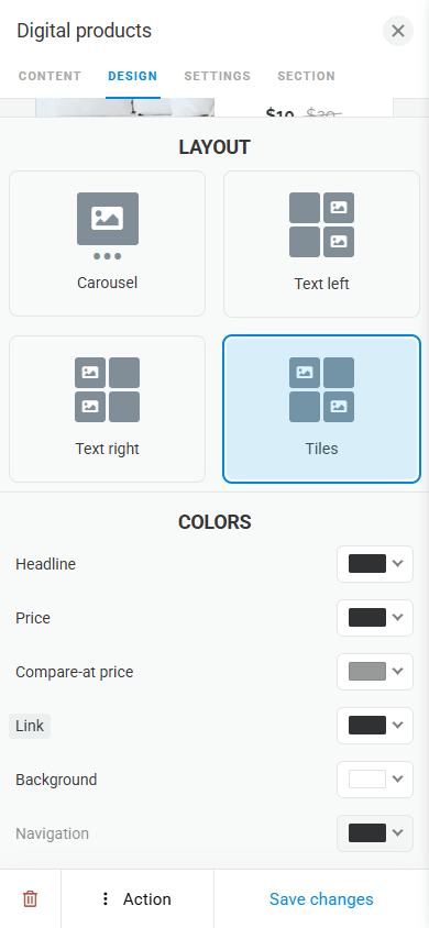
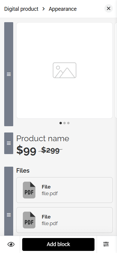
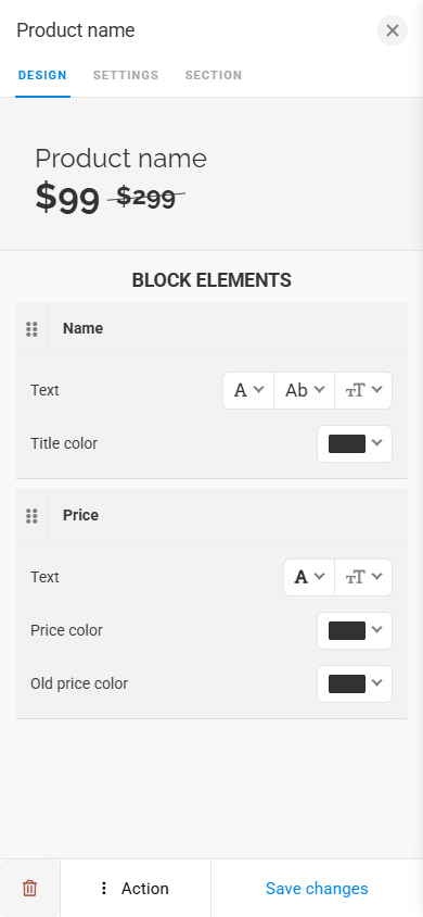
The design of both the Digital products block itself and individual digital product pages is easy to customize. Block design settings offer various layout options, as well as settings for text, button, and navigation icon colors.
Digital product pages consist of blocks. You can add, delete, and change their design in the same way as other blocks in Taplink.
Taplink offers a lot of content blocks. When used thoughtfully, you can create a page that informs, engages, and encourages visitors to take action. Flexible design settings for each block help adapt them to the style you need and make the page look professional and modern.